Linocut Printmaking: Happy Birthday 2023
January 23, 2023
This print exemplifies the all too familiar irony when it comes to creative projects in my life: The higher my expectations are for the outcome, the further the final product lands from those expectations… and vice-versa. For example, the print I finished earlier this month (the Happy New Year 2023 card) turned-out much better than I thought it would and the feedback I received was overwhelmingly positive. That confidence was carried into the production of this print, making me feel it was surely going to be even better, but the final prints ended-up horribly flawed.
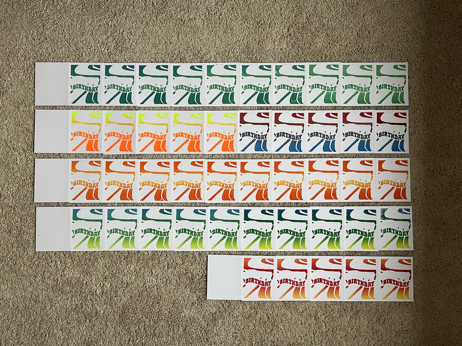
As always, it was a learning experience and I think that the water-based inks I’ve used in my printmaking projects up to this point will need to be replaced going forward. This is especially true of the fluorescent inks that I used on almost every print in this series. The inks don’t coat the roller or the plates very well, and when the printing press is used the plates tend to shift and smear the final print. The attitude I adopted was a bit too laissez-faire, perhaps, in that I didn’t put enough thought into how the colors of the two plates would work with one another. Overall, I was excited to approach the color combinations randomly, which would create more unique cards, but ultimately applying a top print (with lighter colors) over a bottom print (with darker colors) resulted in a lackluster result because the top print couldn’t mask the bottom print.
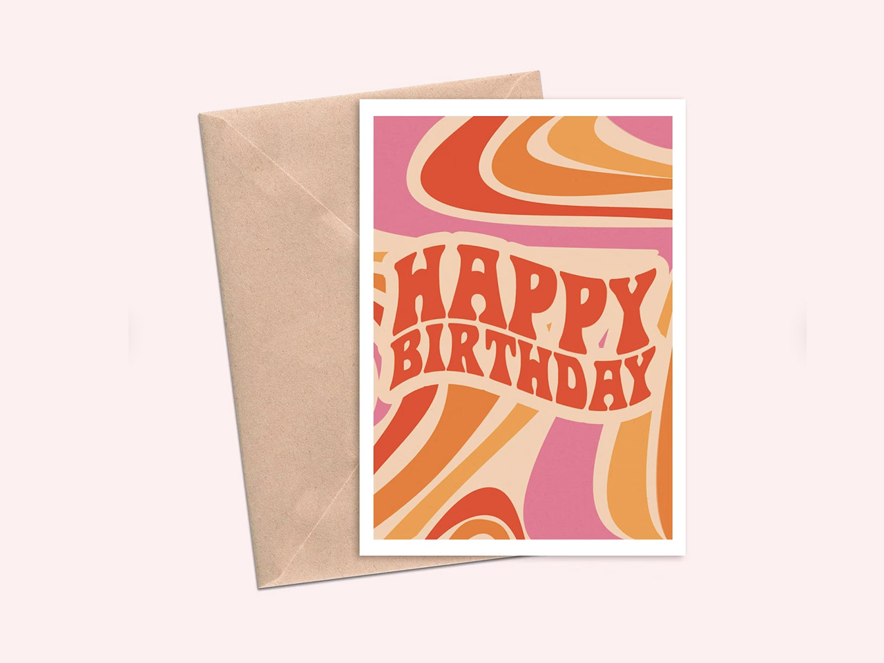
Regardless, I do actually love most of the color combinations in the cards. The design (which I lifted from this vendor on Etsy) immediately struck me as something from the 1960s “Flower Power” era, and some of them turned-out perfectly. Again, I think they reliance on the fluorescent inks was a real problem, but I didn’t have any non-primary colored inks and have only had mixed results trying to achieve them by adding white ink to lighten them up. Given the limited resources, I kind of just have to live with the final product, learn from the results and hope the next prints turn-out better.
Anyway, check-out the pictures and the video below for some insights into the process.
Image Gallery
- Inspiration from SunflowerArtworkGB on Etsy The card I used as inspiration can be found on this Etsy page of SunflowerArtworkGB.
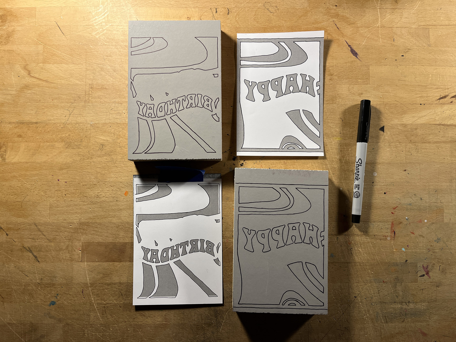
- Plates Inked + Ready For Cutting
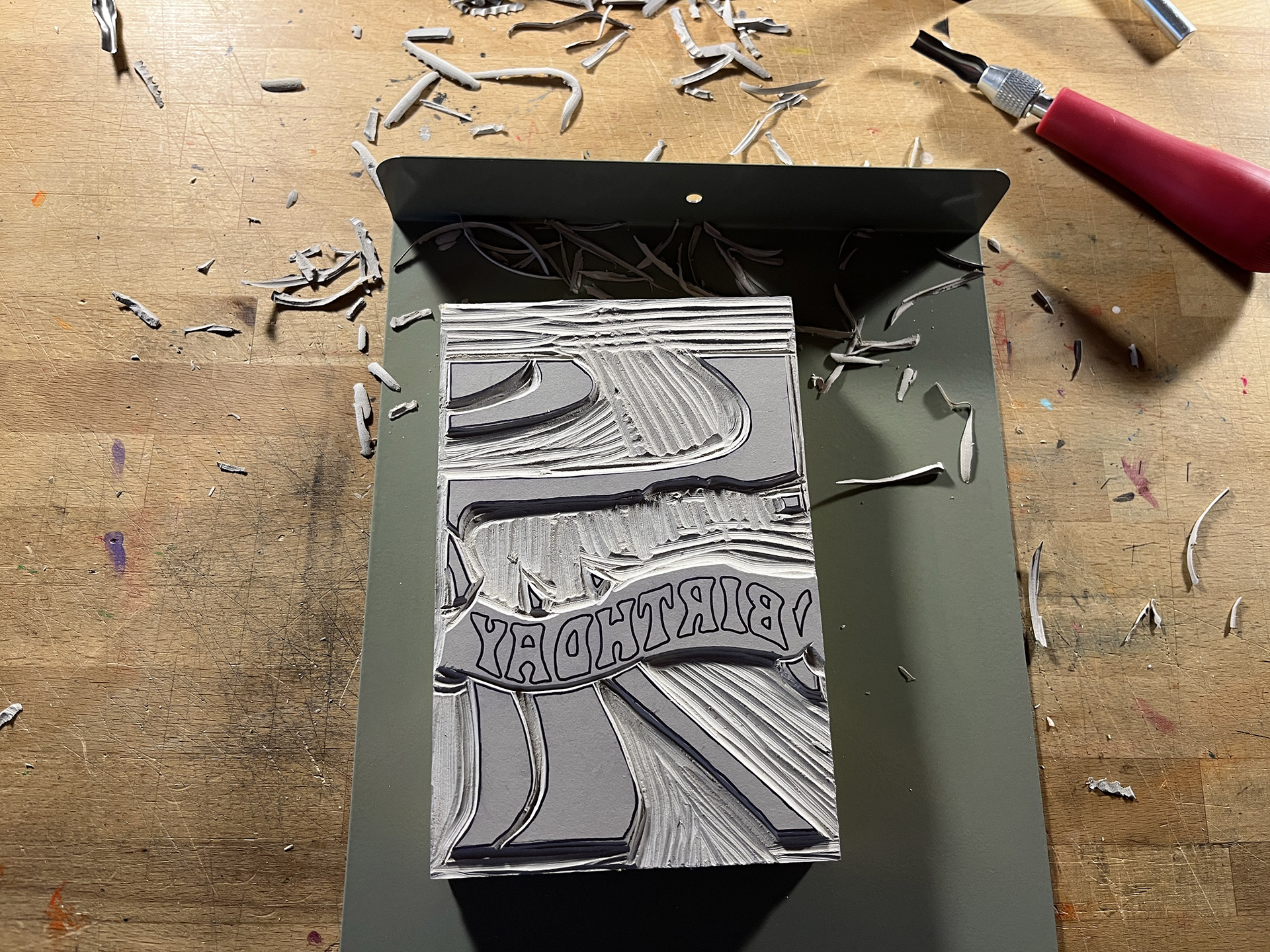
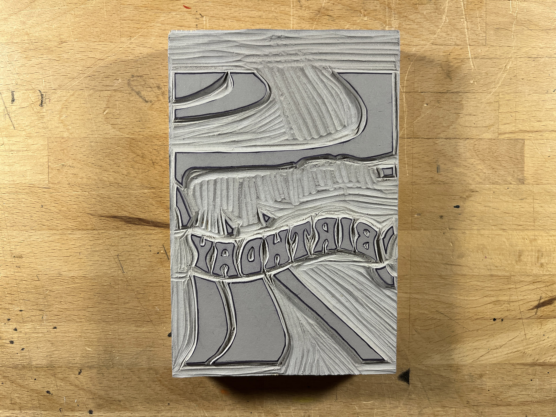
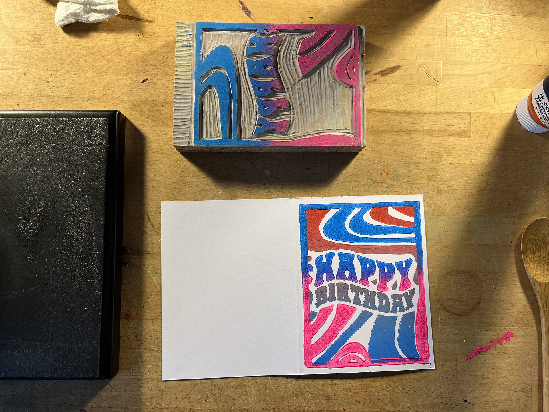
- Plate #1 Progress When I got to the letters, I took a break. They were more intricate than I thought they were going to be and the curved edges were going to be difficult.
- Plage #2 Finished My friend called me up during the day, so I decided to take a break from working and cut-out this plate while we talked.
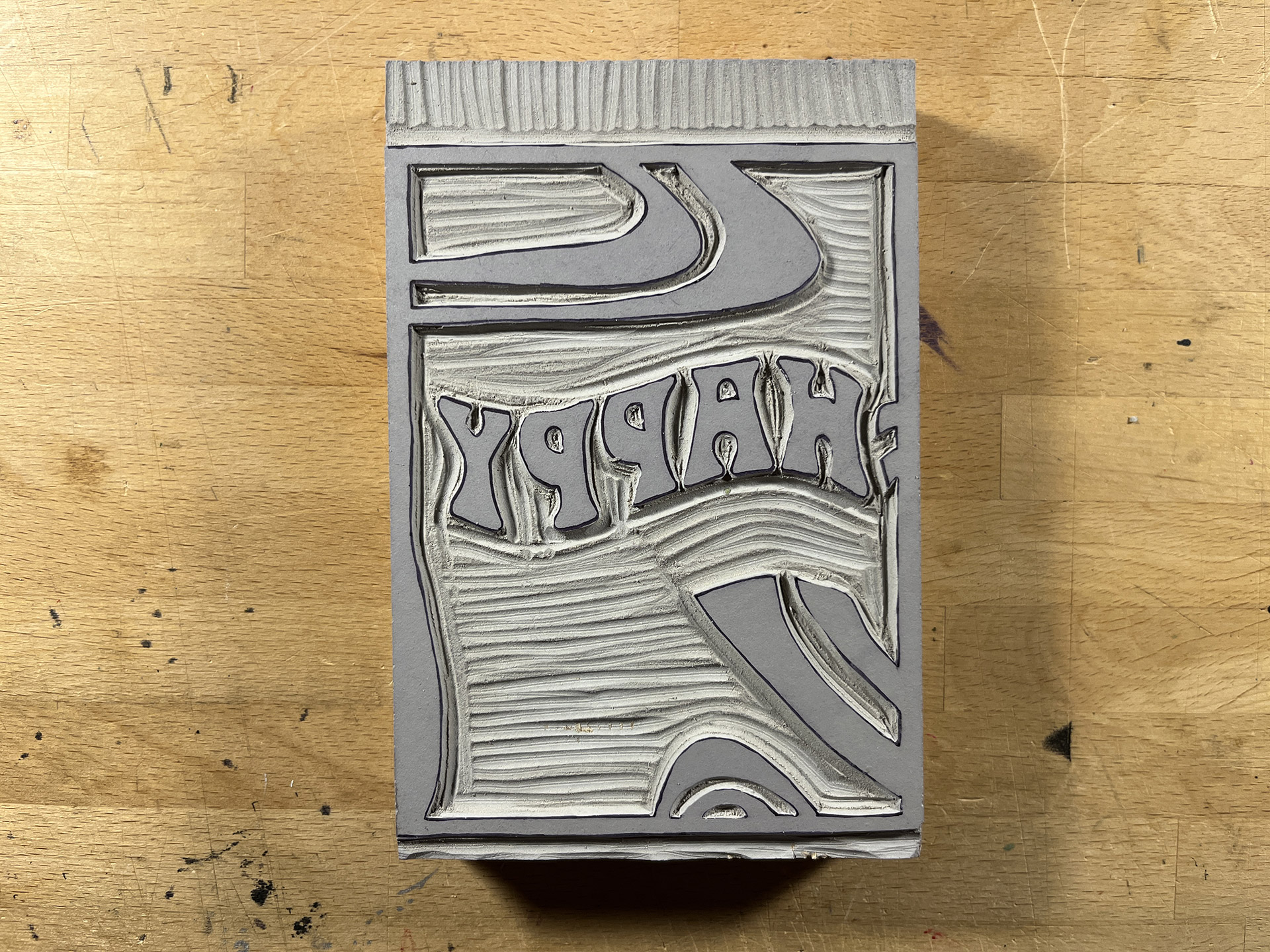
- Plate #1 Finished After finishing-up the first print, while talking to my friend, I went ahead and finished-up the lettering on the first plate. It was as difficult as I thought it would be.
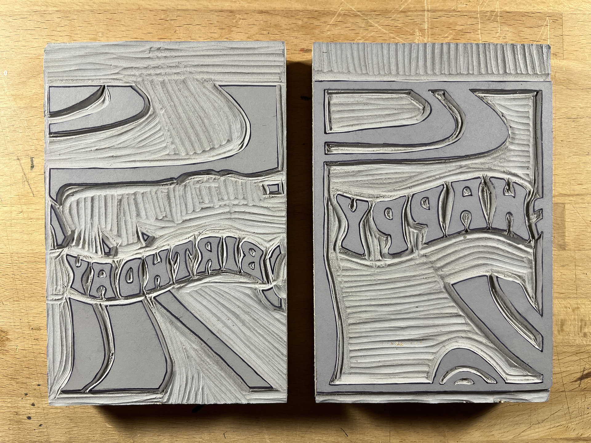
- Plates Ready For Printing
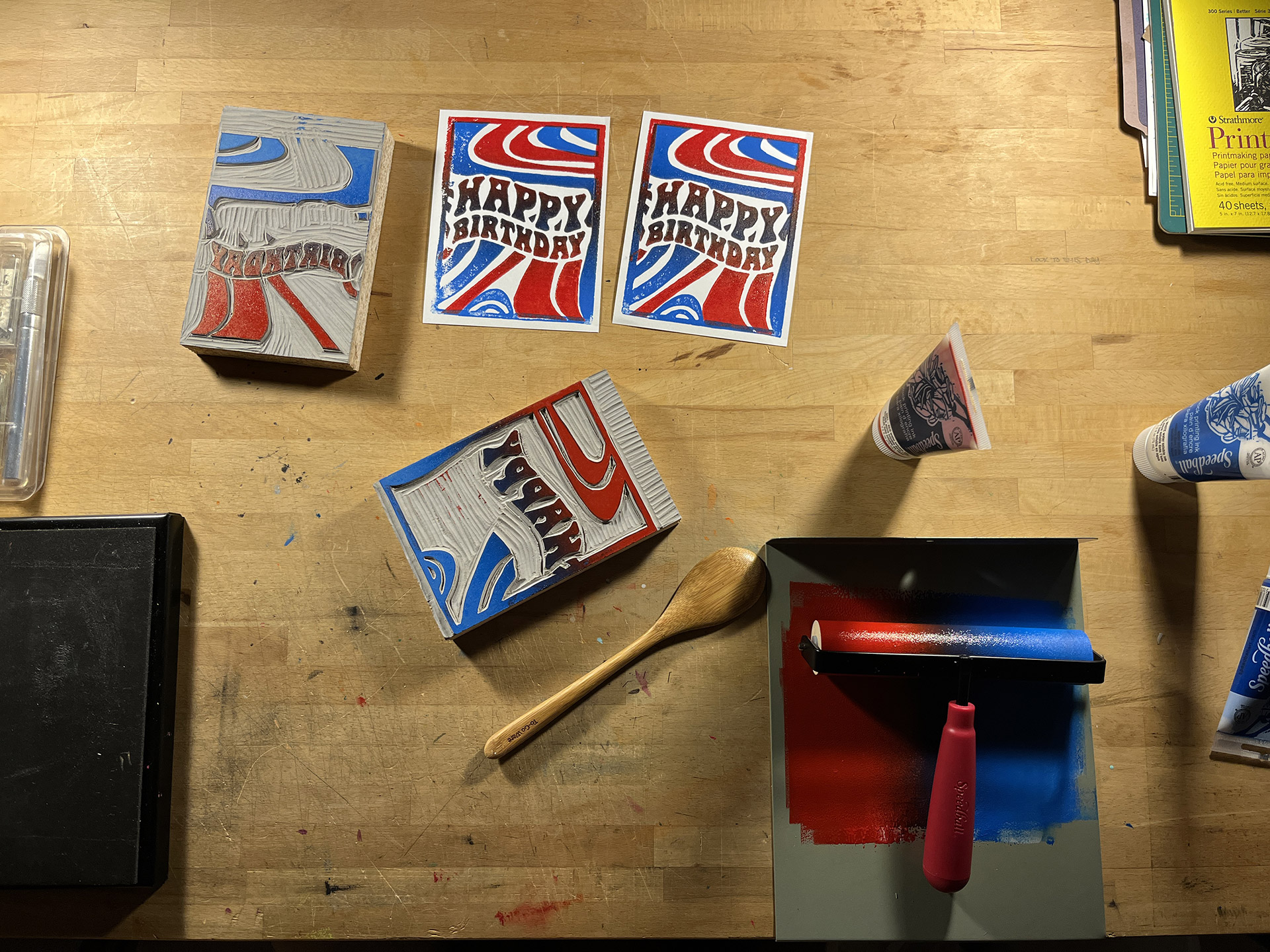
- Test Prints The test prints revealed that I need to cut away some pieces to give the print more room for shifting. Overall, I was happy with it.
- Plate #1 Finished I've apparently stopping taking process photographs.
- Process Photograph Had to force myself to take at least one photograph of the process. This is a good example that shows the smearing + how the lighter ink on the top plate couldn't mask the darker ink of the bottom plate.
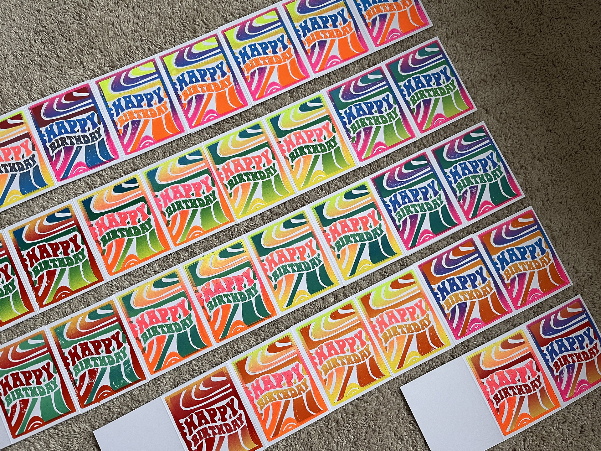
- Working At this point, I was pretty happy, but they look much better from a distance.
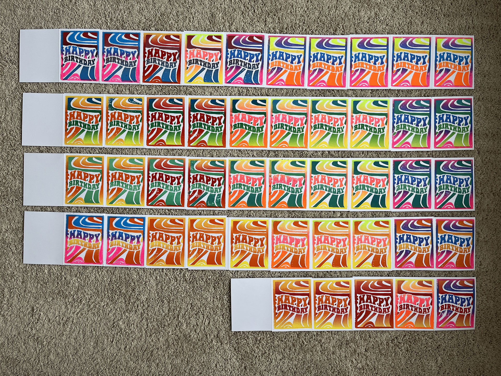
- Finished Yeah, from this perspective, the prints look really great. When you get close, however, they lack.
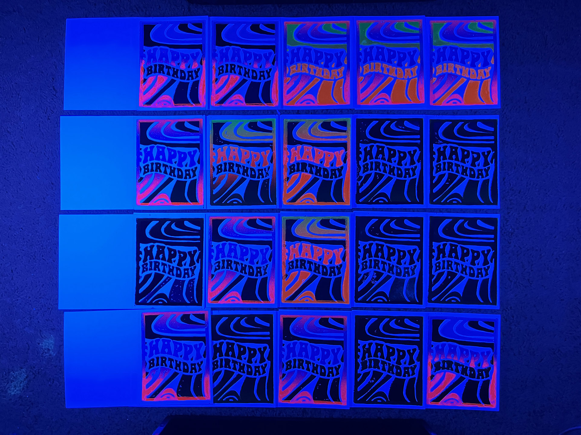
- Fluorescent Glowing Tried taking a picture of the cards under the black lights. Almost every card had at least one layer of fluorescent ink, but these inks don't really glow that well at all.
Video Gallery
- Happy Plate A time lapse video depicting the cutting process of the "Happy" plate used in this print.
© 2026 60bpm