Linocut Printmaking: Happy New Year 2026
January 16, 2026
Another Year, Another Print
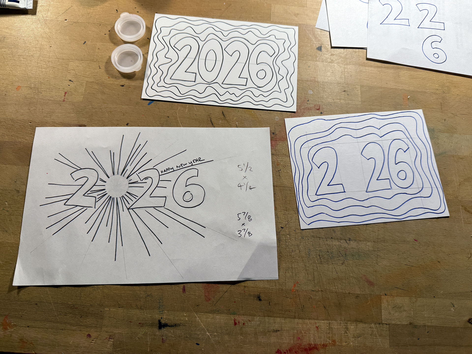
Around my mother’s birthday–which occurs in early December and is the last birthday on my recipients list–I begin worrying, er, thinking about what I’m going to do for the two prints (Happy New Year and Happy Birthday) I create each year. The 2023 Happy New Year print was well received (and it’s one of my favorites as well), so I spent some time looking for inspiration in the 2026 zodiac (the year of the Horse) but couldn’t find anything that I liked or thought I could pull-off. Then, I played around with a sort of Great Gatsby/Art Deco design, but decided that it was something that I’d have a hard time pulling-off. Eventually, I found something that interested me, and the sketches I made led me to incorporate a technique that I used to play around with back when I first started drawing and painting.
The Wind-Blown Technique
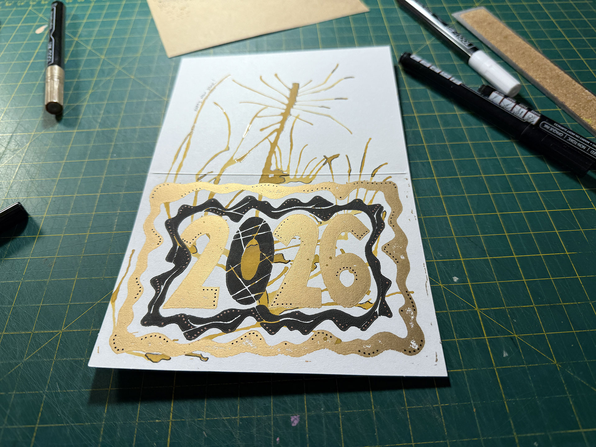
This isn’t anything revolutionary or something that I invented, but, when I got into drawing and painting, one of the first techniques I enjoyed was blowing blobs of watercolor paint or ink around on paper to create weird designs and effects. (Here are a handful that I dug-up from my archives.) The idea I came-up with for the card involved replacing the zero in “2026” with a wind-blown blob, which eventually evolved into a concept that would involve three layers:
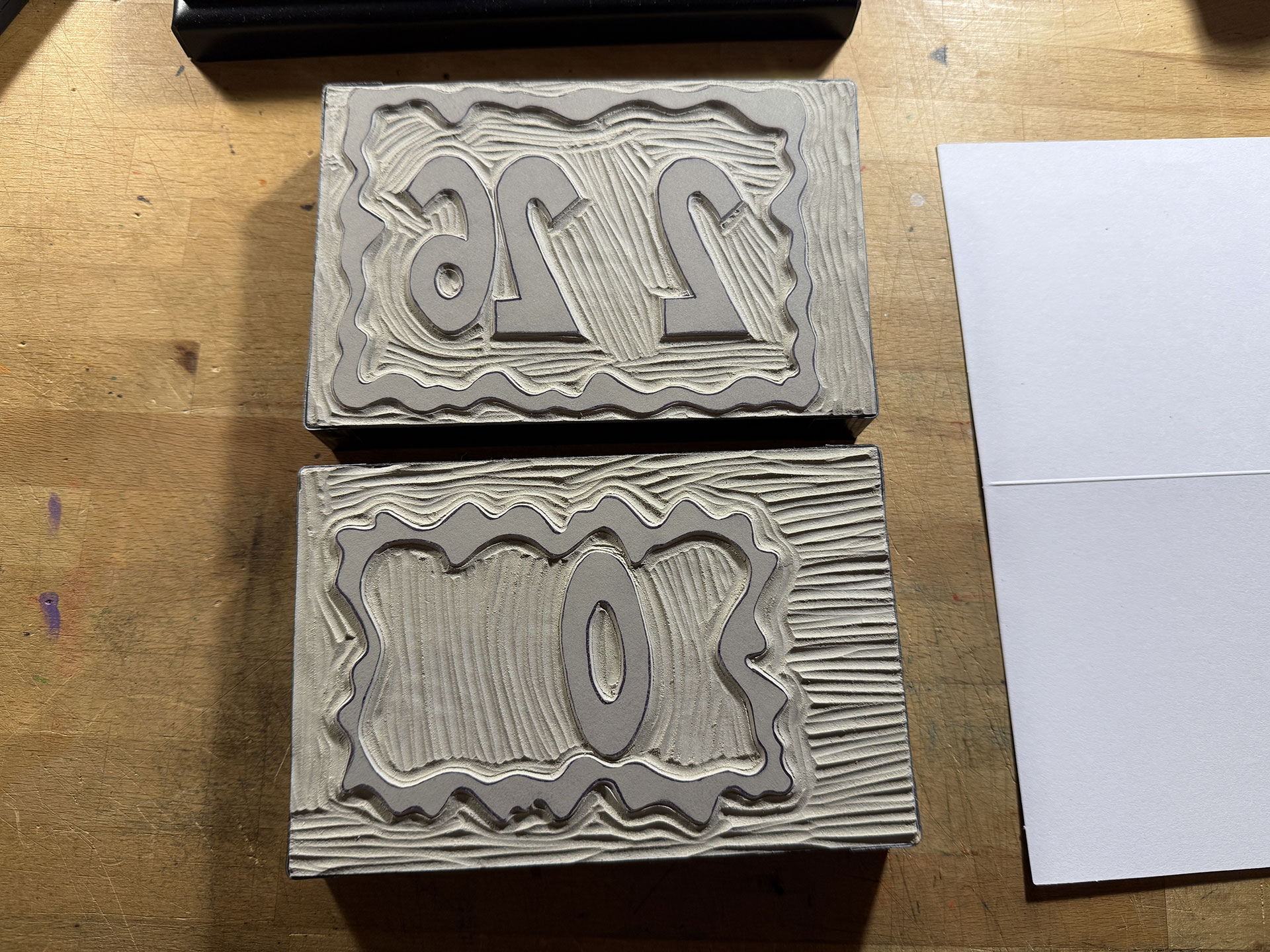
- Bottom Layer (Plate 1): The outer border along with the 2, 2 and 6 in “2026”
- Middle Layer: This is the wind-blown blob that begins in the middle of where the zero would go and then spreads-out over the bottom layer and onto the rest of the card’s surface where I would write-out “Happy New Year” by hand
- Top Layer (Plate 2): The inner border and the zero in “2026” — Possibly carving-out the zero completely, but we’ll see
The final product would have a layered effect where the blob would be going over some elements and underneath others.
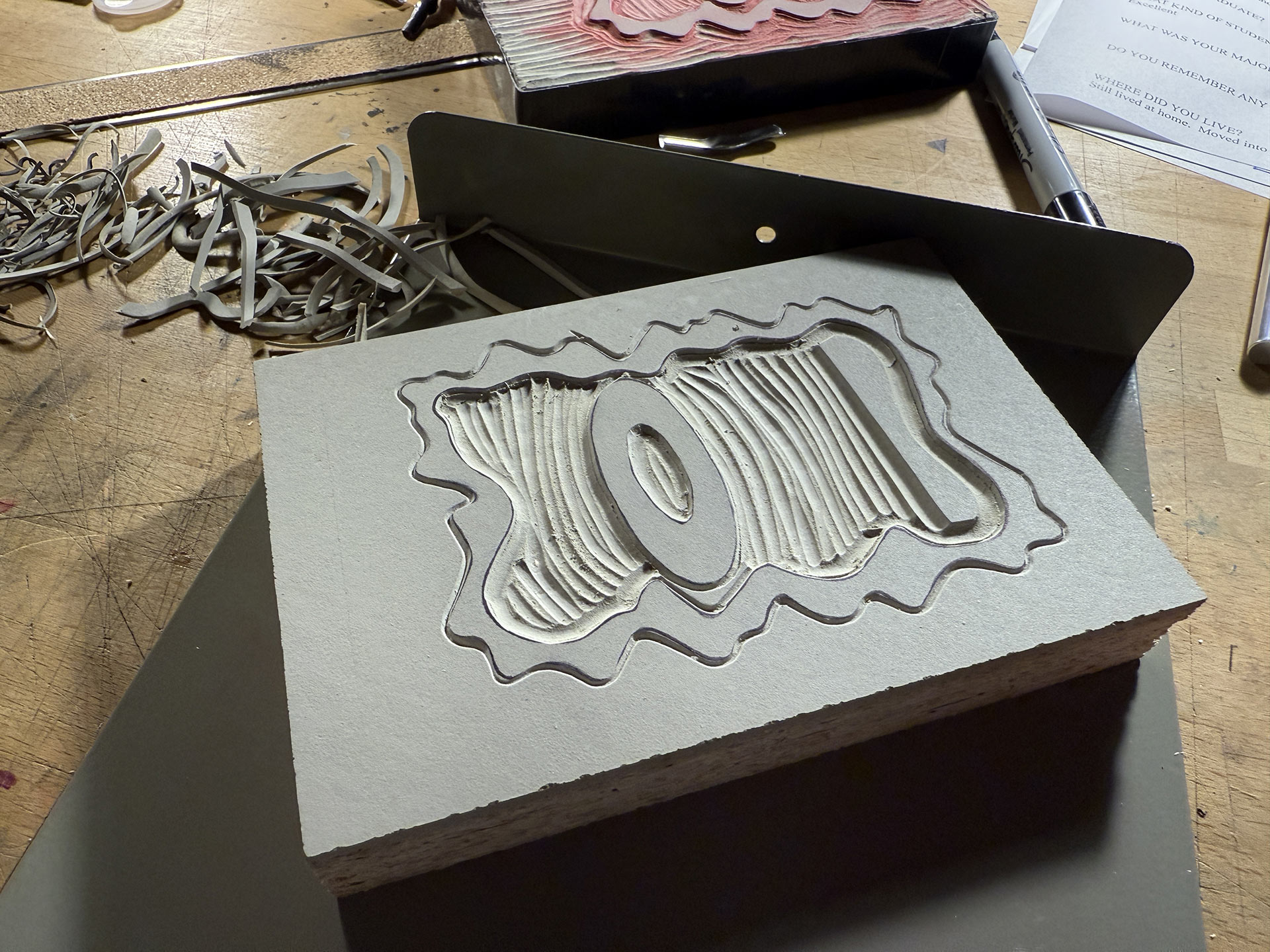
Designing and Carving the Plates
The design for the card was super simple, as there were no intricate parts besides the edges of the numbers, which was a nice change of pace. The plates were carved relatively quickly and a test of the first plate looked good. However, for some unknown reason that I still can’t grasp, I neglected to test-out the second plate to see how it would all fit together. Maybe, after the previous four years of doing these prints, I figured it wasn’t necessary, but I was wrong.
Leveling-Up: Oil-Based Inks
After years of linocut printing with water-based inks, I decided to give oil-based inks a shot this year. The benefits would be inks that were much more reliably opaque and smooth, and final prints which were not horribly fragile. If you’ve ever received one of my previous prints, you may have noticed how easily the ink flakes away if you touch it (or worse what happens if water comes into contact with the print surface).
The major disadvantage of working with oil-based inks is that they can be more difficult to clean-up, but I watched a bunch of videos on using them and cleaning-up after them and realized, in some ways, they’re actually nicer to clean-up. For one, cheap vegetable oil seemed to do the trick so mineral spirits weren’t necessary. Also, I didn’t have to use gallons of water washing off the tools and plates; I just used old newspapers and t-shirts to wipe it all down.
That being said, there was one more disadvantage that I was going to discover shortly.
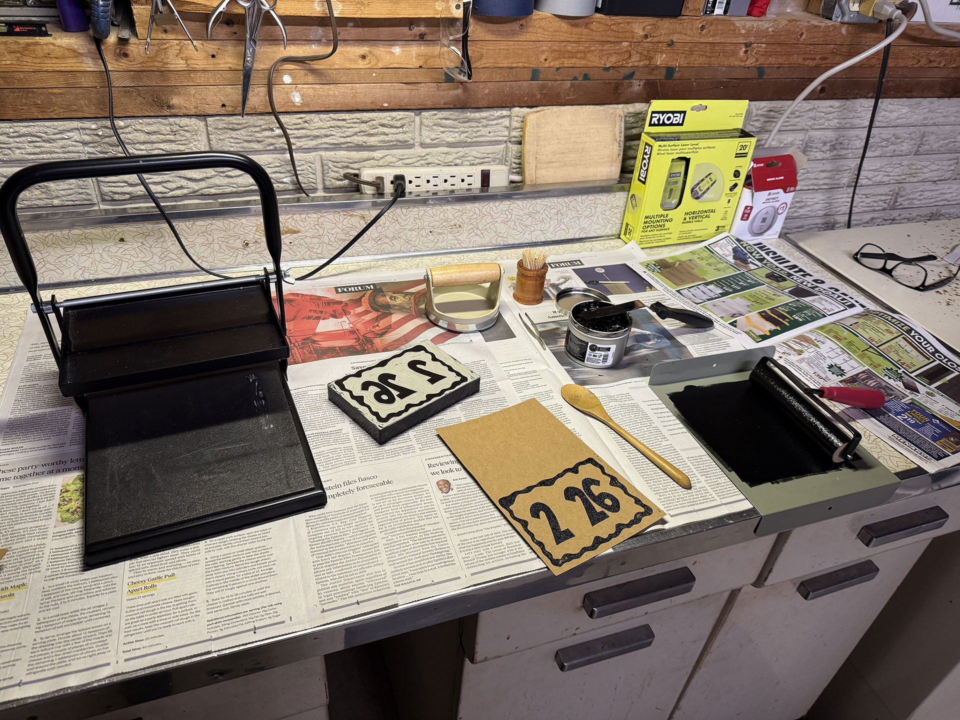
Printing the First Plate In My New Workspace
Despite all the research, I was still kind of scared to use the oil-based inks. Ultimately, they cover more effectively than water-based inks, just like I’d hoped, and the clean-up wasn’t that bad. Best of all, the ink doesn’t immediately start drying on the roller, plate and ink sheet, which is a total pain in the ass with water-based inks because it forces you to either add more and more ink to everything or routinely clean everything off.
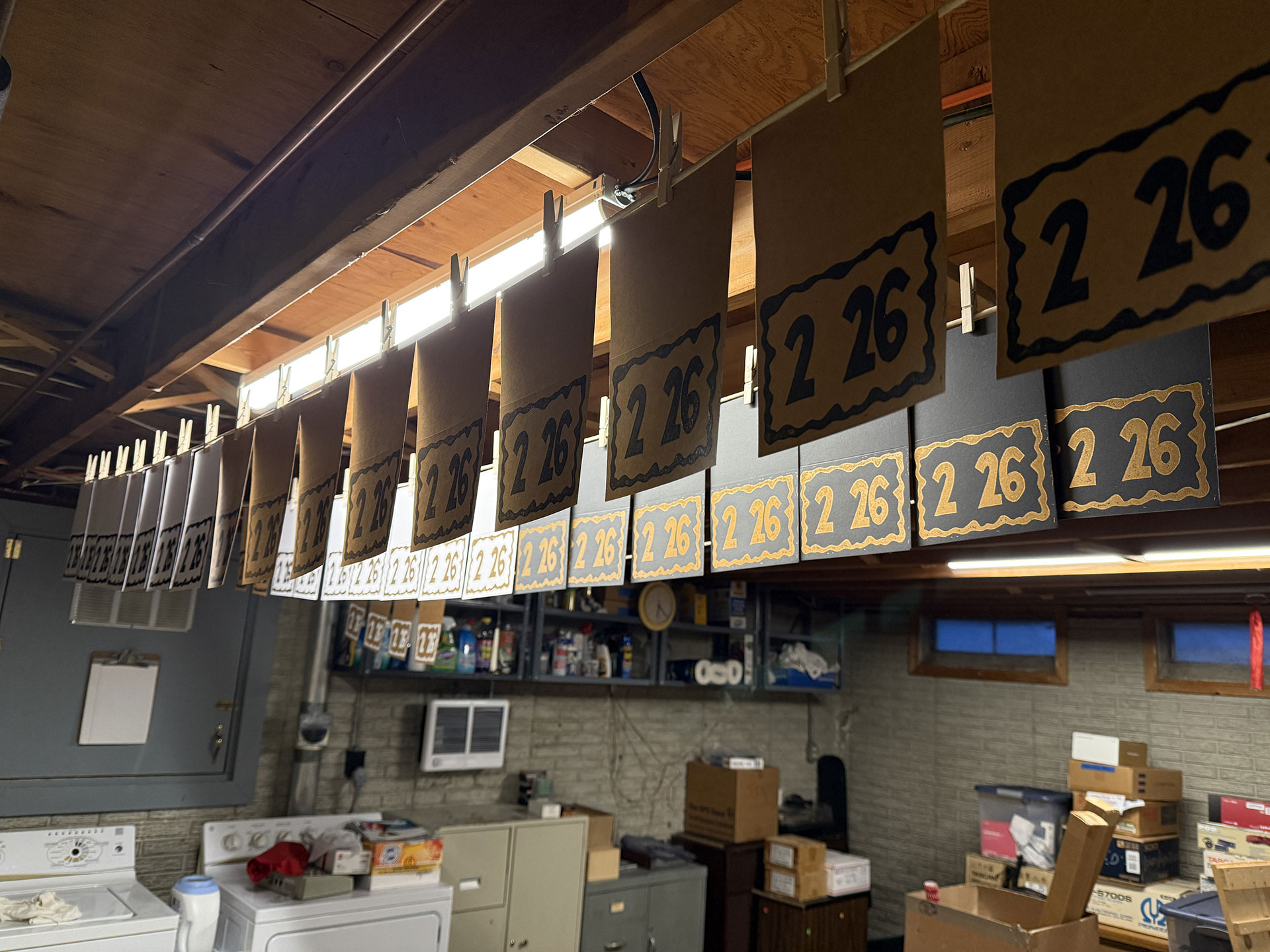
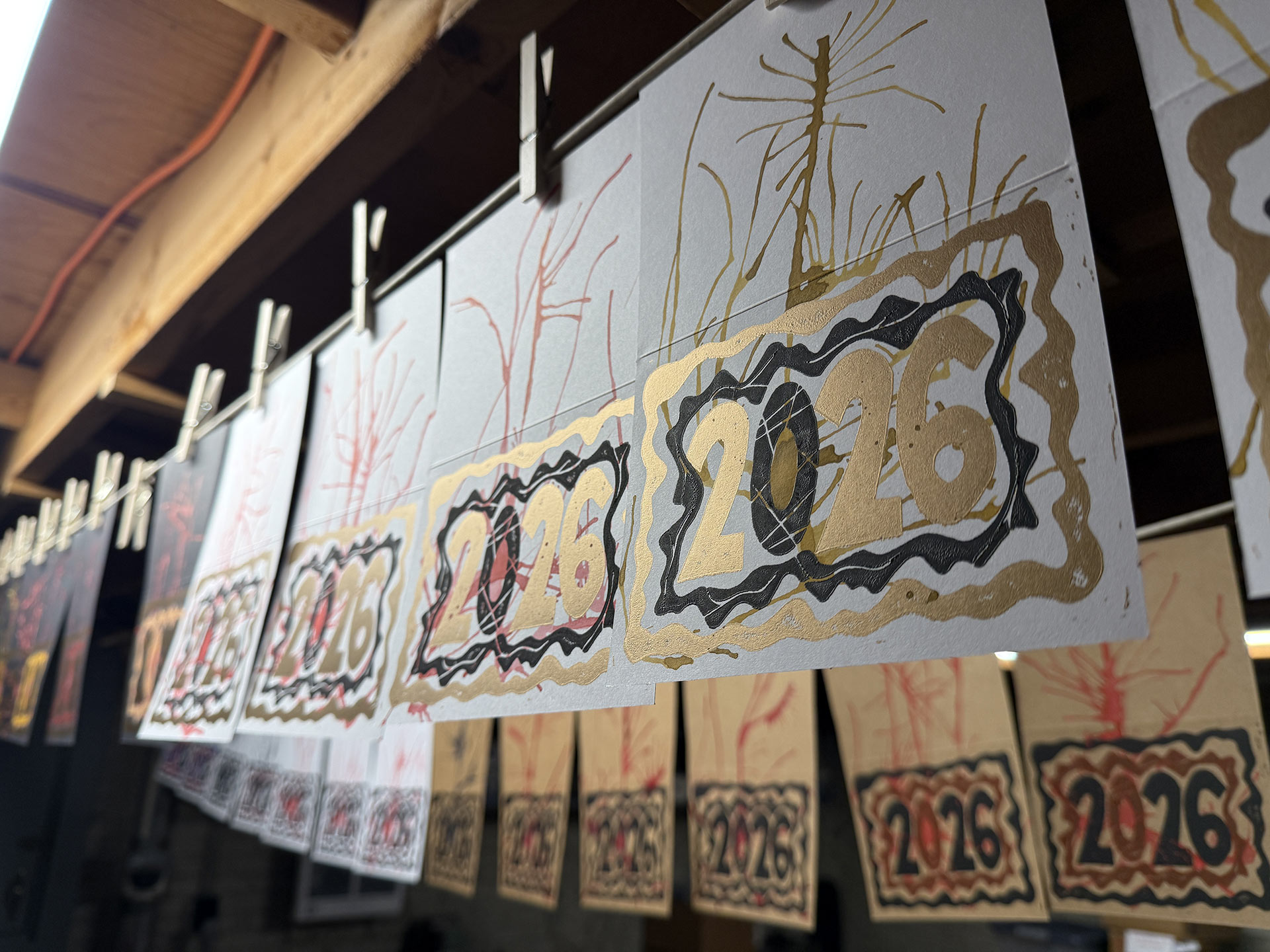
The best part about the process, though, was performing the work in my “new” workspace, which wasn’t new at all because it’s the basement of the house I grew-up in. In the fall, I moved back into the house and have been discovering the pros-and-cons of the situation over the past three months. A definite PRO is the basement workspace which includes: a workbench that’s the perfect height (I’m not hunched-over the entire time), a stationary tub at the ready and clotheslines for hanging prints to dry!
The Oil-Based Ink Catch (I’d Somehow Missed)
The day after hanging the prints, I checked them and discovered that they hadn’t appeared to begin drying at all. Some quick research informed me that, unlike water-based inks which can dry in less than a day, oil-based inks can take days, and (if they were applied too thickly) may never dry completely! So, despite actually getting the first plate printed before the new year, I was at the beginning of a possibly indefinite wait before I could continue.
Which is why nobody received this print until late-January.
This time was spent researching how to speed-up the process of drying oil-based paints, which mostly involves a handful of different ink-additives to choose from (something that can’t be applied retroactively). The delay gave me time to order the supplies, along with a handful of additional oil-based ink colors, in preparation of the second plate.
Applying the Wind-Blown Layer
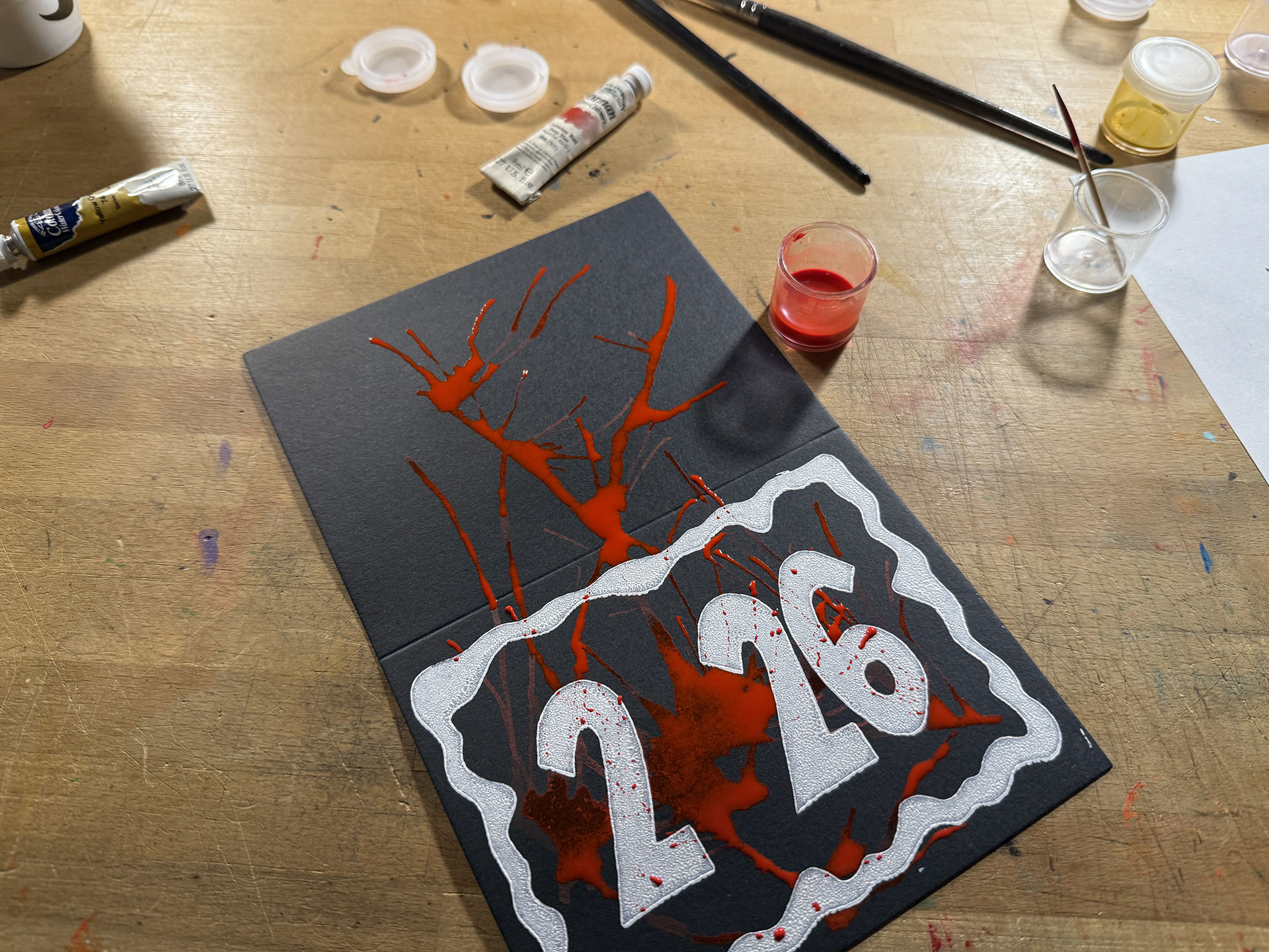
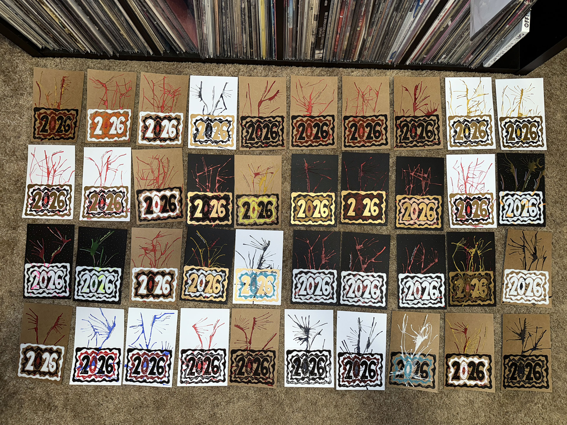
Around the time the new supplies arrived, the first layer of most of the prints was dry enough to apply the watercolor paint layer. The black and gold versions were completely dry, the gold ones turning-out beautifully. I’ve got a gold water-based ink on hand that I’ve tried using a few times, but it just never covered that well. On the other hand, this stuff was perfectly flat, opaque and smooth! The white layers were still a bit tacky because they’d been applied too thickly, but I didn’t have any more time to wait, so I just moved forward with the watercolors.
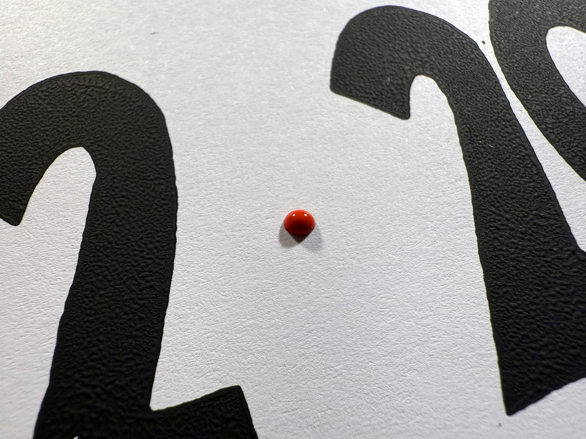
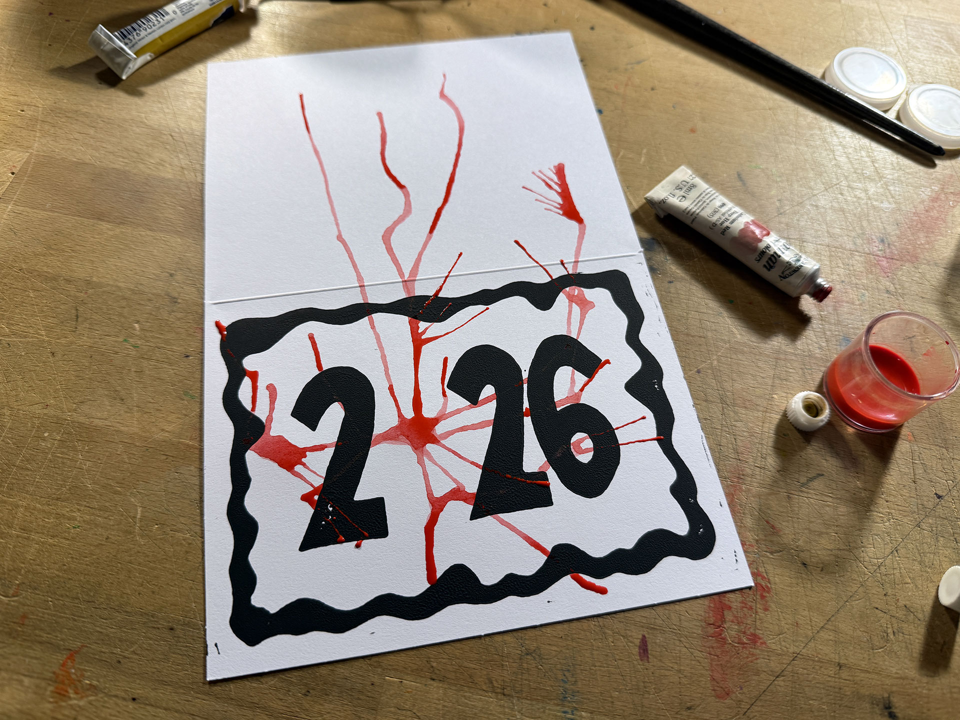
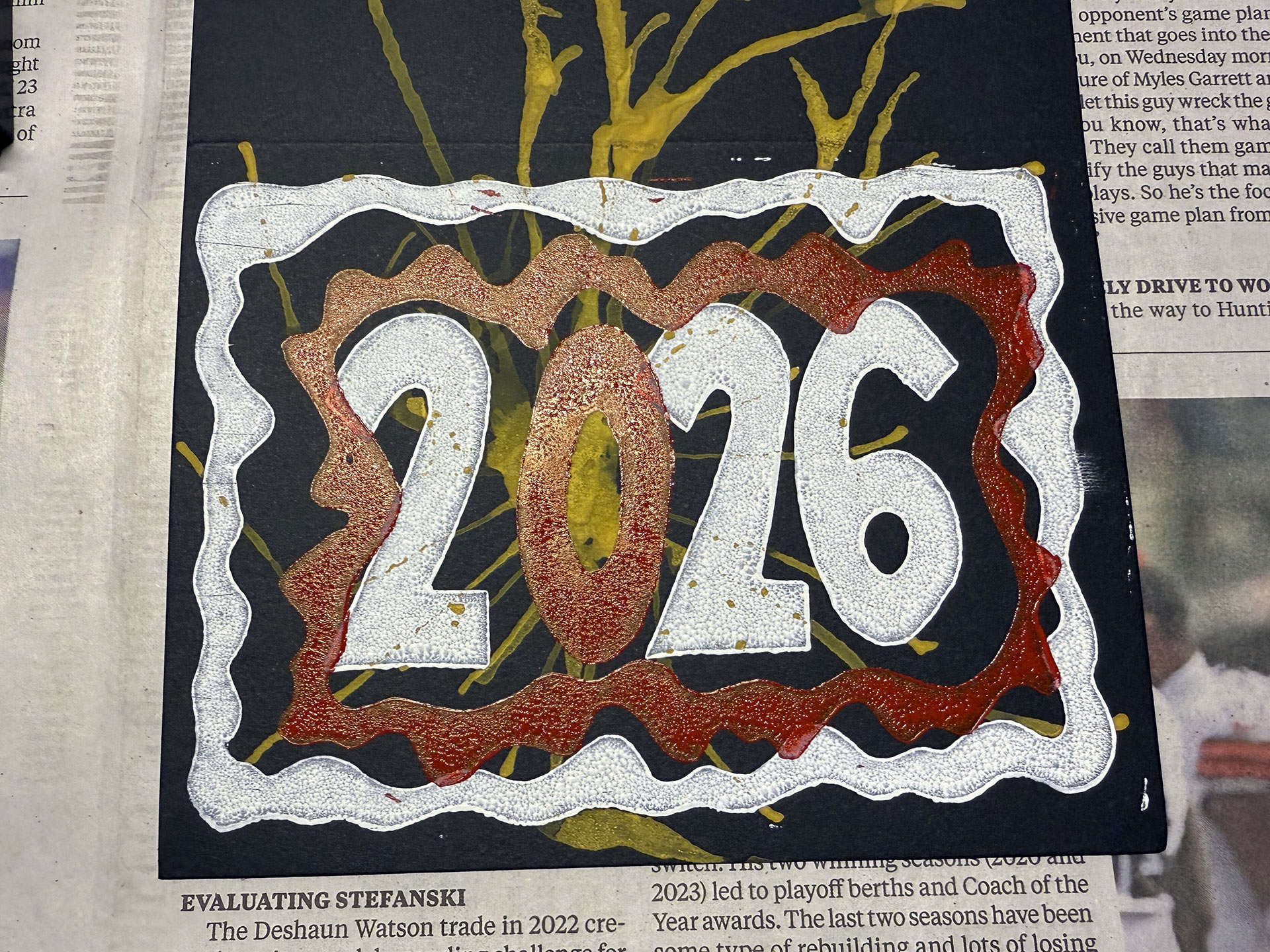
I became happy with the results, once I stopped trying to use a straw to direct the paint and just used my mouth. Unfortunately, the oil-paint (surprise, surprise) was so hydrophobic that my desire to have the watercolors overlap the ink almost completely failed. The gold ink rejected the watercolor completely, but the white and black allowed a little overlap. Mostly, I just got splatters that looked like someone was murdered next to me in the case of the red watercolors! The process took a long time, but I was satisfied with the final result.
Second Plate Blues
Once the watercolor layer was dry, I gave the oil-based ink with the speed-drying solution a shot. Before I even had a chance to worry about the speed of the ink drying, I was shocked to discover that the second plate was badly misaligned. Three or four cards were ruined before I finally accepted that I wasn’t misplacing the plate, but that the design had been carved about a quarter of an inch off.
This left me with a decision to make: keep trying and see if I could eyeball the adjustment, or redo the second plate. If this had been one of my previous year’s designs that had more complex angles and details to carve-out, I may have gone with the former option. But, given how simple this design was (and the fact that I’d just replenished my supply of linocut blocks), I decided to redo the plate.
Which is another reason why nobody received this print until the end of January!
The process added another day, which was fortunate in a way because the next day I discovered that the oil-paint didn’t appear to be drying any faster. Given how much the project was already behind schedule, this led me to finish-off the print using my water-based inks instead, which went smoothly.
Final Touches
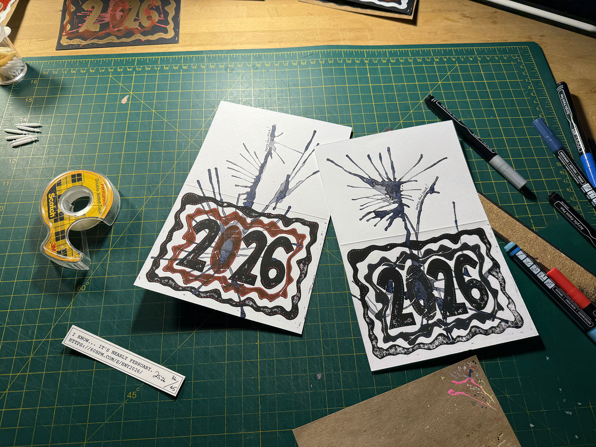
As I did with last year’s prints, I used my acrylic paint pens to enhance the final prints, while I added the “Happy New Year” inscriptions and used a pen to outline bits of the watercolor layer. This step took the most time of any other in the project. As usual, I started-off just adding a bit here and there, but, about a quarter of the way through, I was enhancing this shit out of every card. The final cards were beautiful and every one was truly unique, but it starts to defeat the purpose of mass-producing something when so much effort is put into each individual piece.
Anyway, print one of two is completely. Onto the next.
Image Gallery
- Brainstorming Some sketches I made while trying to come-up with an idea
- Plates Ready For Carving Here are the two plates, inked and ready for carving.
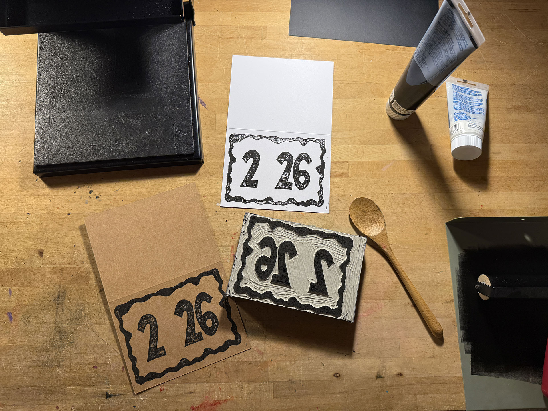
- Plates Ready For Printing The misplacement of the bottom plate isn't that obvious, but I can see it now that I've gone through the process.
- Test Print Here I am testing the first plate. Why not both?!?
- Printing the First Plate At my new workbench, printing the first plate using my oil-based inks. The fact that the ink doesn't dry on everything while you're working is great.
- Gold Ink This stuff was kind of gross to work with, but the final results were beautiful.
- Prints Hanging To Dry This is a nice feature for a print maker!
- Watercolor Blob A blob of watercolor paint ready to be blown around.
- The Wind-Blown Effect The final result of the second layer.
- Bloody Results As I was going along, I felt kind of weird because the cards looked like something out of a horror movie. While I was distributing the cards, I tried to keep in mind who would/wouldn't be disturbed by this version.
- Second Layer Finished The watercolors dried quickly and allowed me to do multiple layers on the single night. The paper warped considerably, but I was able to manage it during the printing of the second plate.
- Oops! An example showing how badly the second plate had been misaligned, and this was probably one that I tried to eyeball an adjustment to fix it but it was just too bad.
- New Plate Carving the second plate for a second time.
- Second Plate Comparison Can you see the difference? It's not huge, but it doesn't take much to screw-up a design. That red oil-based ink really stained the linoleum, wow!
- Final Prints Hanging to Dry
- Enhancements Using ink pens to enhance the watercolor blobs and acrylic paint pens to enhance the printing.
- One of the Better Combinations I'm always trying different combinations on the fly. Some turn-out better than others.
- Done Forty of the final forty-five prints.
- Bundled and Ready to Mail And they're off!
© 2026 60bpm