Linocut Printmaking: Happy Birthday 2022
January 27, 2022
It feels like I just did this. Well, as of my writing this post, that’s because I just did.
It’s sort of surprising to myself that this is only the second print I’ve made for birthday cards. My first attempts at printing were done in early 2019 and I remember enjoying it, but I guess I just never got around to it. A lot of things went down in 2020, for all of us of course, so it just must not have been a concern.
Regardless, I built-up some momentum earlier this month when I printed-up my Happy New Year 2022 print and felt it was best to keep it going while I felt motivated. That print, while not excessively intricate or difficult, was a three color print, and I wanted to do something that I could complete in a single stage this time around. Again, being that I’m not artistically skilled in the ways of creating objectively satisfying designs that convey a common narrative, I decided to search online for something that I could recreate.
After a search that lasted all of about ten minutes worth of scrolling and clicking, I settled on this design by Usual Malarkey Prints. It seemed simple enough and I didn’t have any problems imagining how I could easily create variations using color or gradient combinations on the set of forty, multicolored blank cards that I received as a gift on Christmas.
Rather than make you read a bunch of words, I’ll let you go along for the journey in pictures below. Enjoy and thanks for checking this out.
Image Gallery
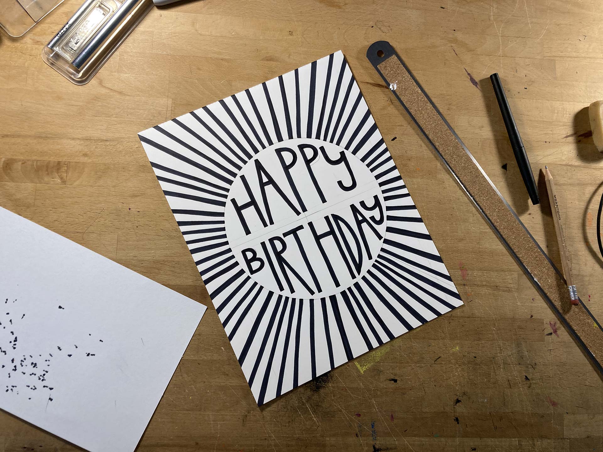
- The Transfer Guide Previously, I'd created the transfer guide in Adobe Illustrator, but I couldn't find a font that worked or figure-out how to skew the lettering well, so I decided instead to just do it by hand, much larger than the final print would be, and take it from there.
- Transferring the Design After scanning my drawing and cleaning it up, I printed-out the reversed guide to scale. While I wasn't happy using the linoleum sheets I had on hand, at least I knew they'd take the carbon paper ink.
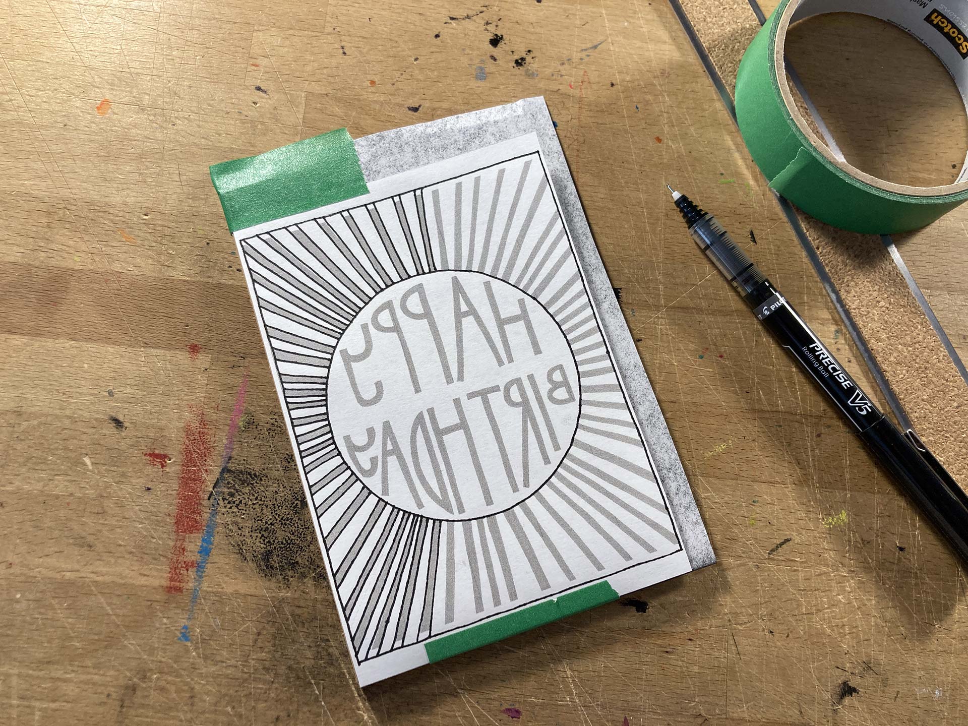
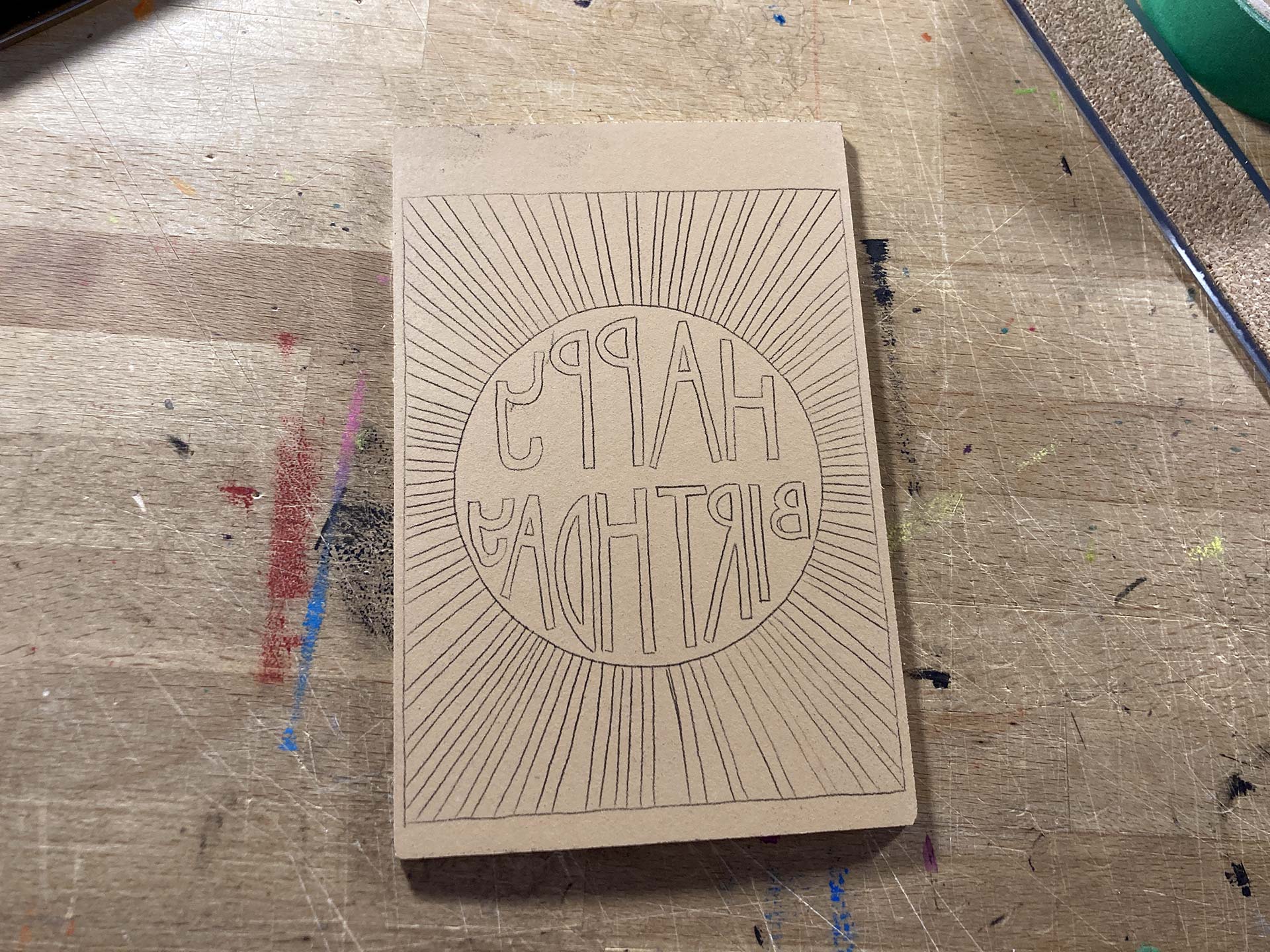
- Carbon Paper Transfer As I was going over the lines, I was worried because my hands just aren't that steady and it slowly dawned on me how intricate this design actually became once I scaled it down. Overall, I was happy with the outcome.
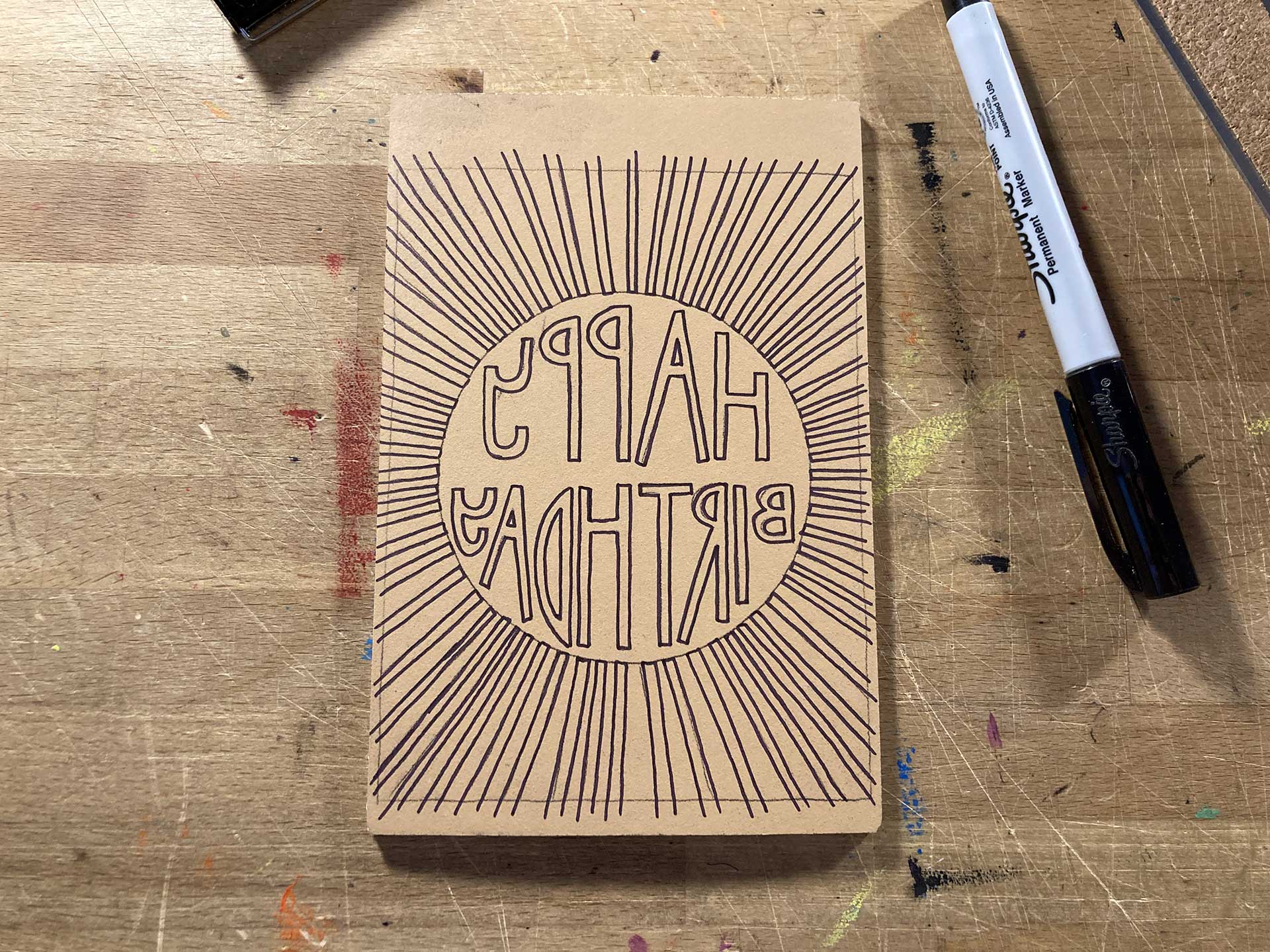
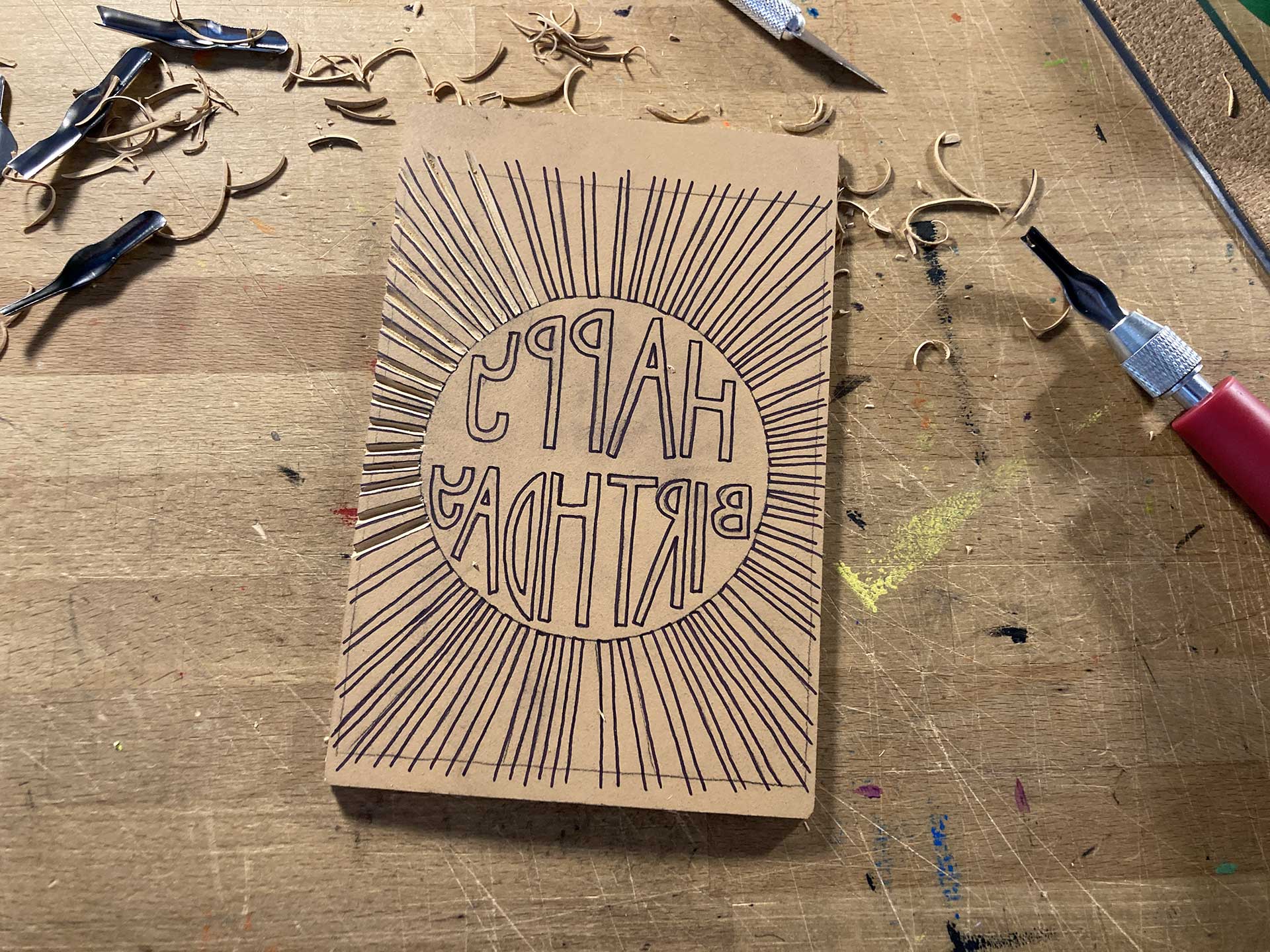
- Reinforcing the Lines While I wasn't thrilled with the task of going over the lines again with a Sharpie marker, it was necessary because the carbon dust would smudge away otherwise. The process also added another stage of degradation to the precision of the lines, but there's no way around it.
- The First Cuts Despite having taken so much more time than I'd thought on this first day, I couldn't wait to cut a few lines, just to see how easy or hard it would be to cut the straight lines. It wasn't that bad. (Note the smudging of the ink already.)
- The First Letter Okay, so the straight lines were okay, but what about those letters, especially the ones with the curves? And how about those square ends? I did just this one letter and decided to give it a rest for the day because I realized it was going to be a bit of work.
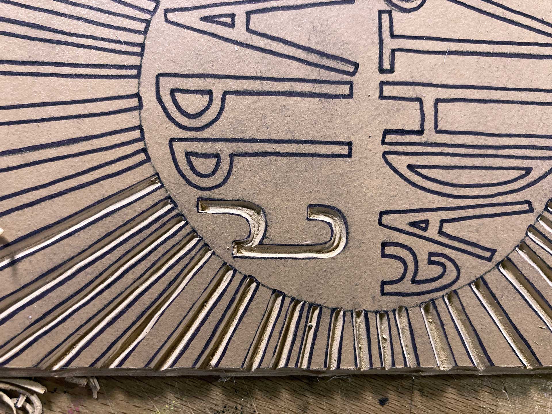
- Just About Finished The lettering proved to be arduous. The ends of the lines were square, so I basically had to use an X-Acto knife to pre-cut the ends and corners, so that when I got to them they'd pop-out without tearing the linoleum. The worst part were the floating bits (e.g. the "holes" in the letters P, A and B) because once you start removing stuff around such small pieces of linoleum, those little floating bits just want to shear off. There was a lot of sweating.
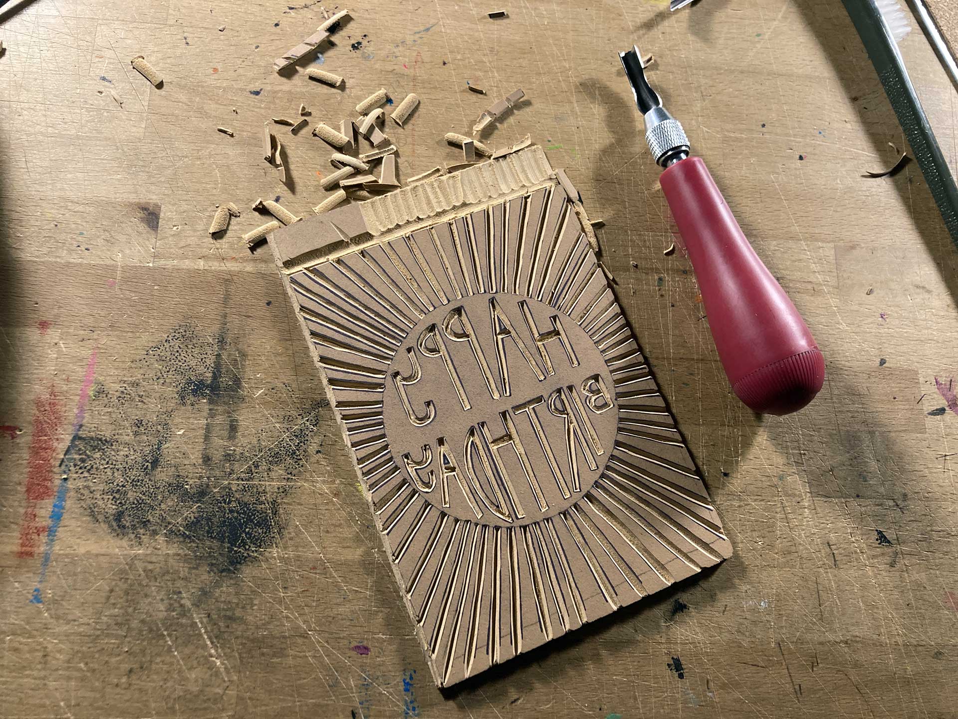
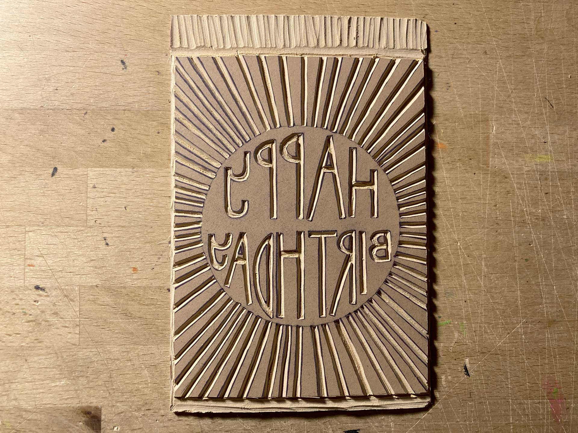
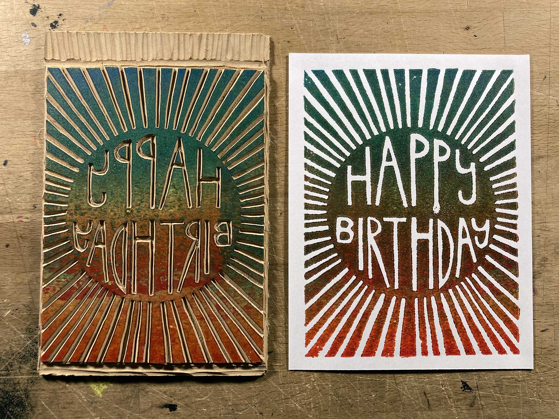
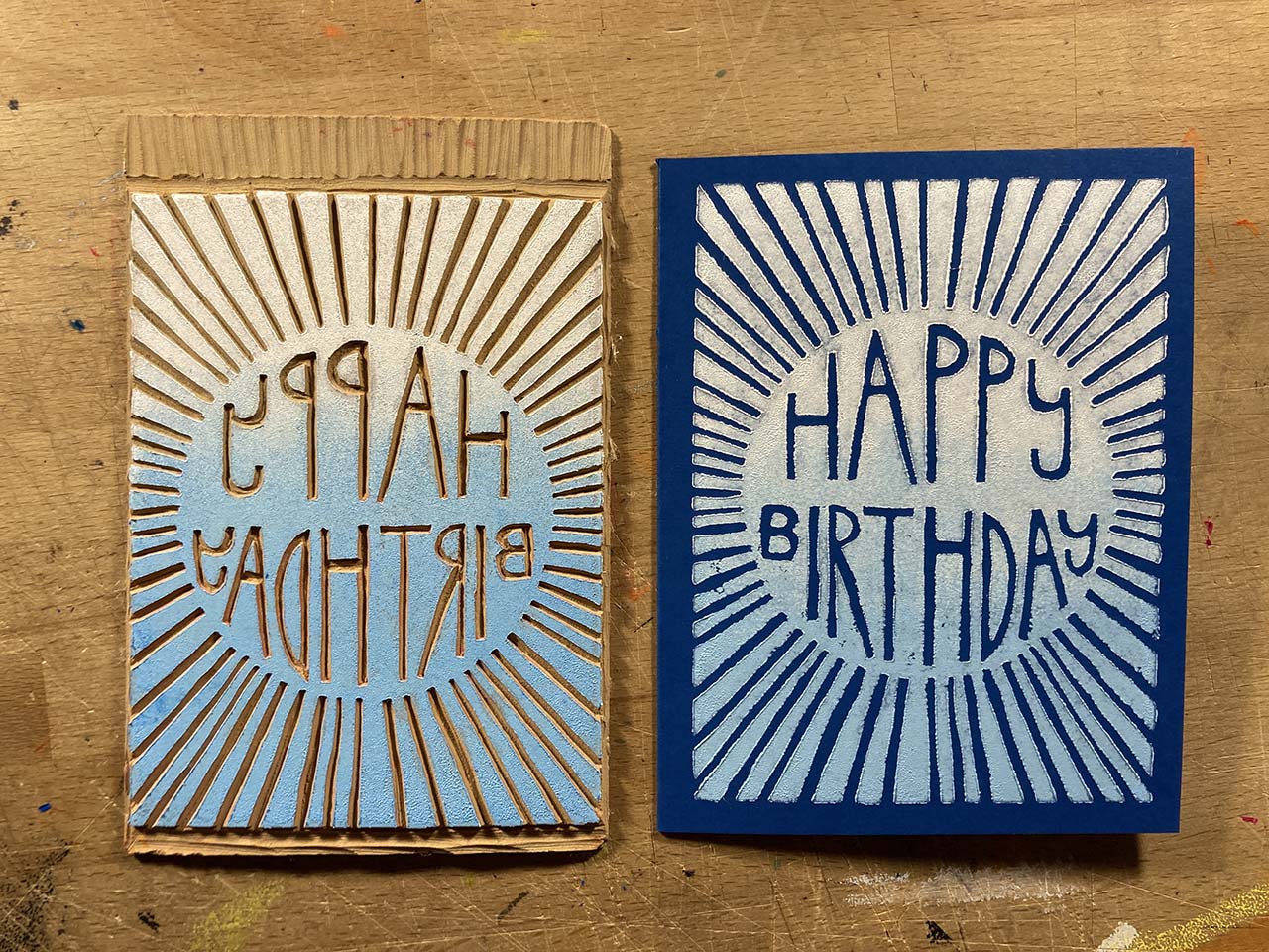
- Finished Plate The plate is done... and I didn't cut myself once! Hopefully a lack of blood doesn't prove to be a bad tiding. Overall I'm happy with how it turned-out, but I'm anxious to do some test printing and see if I need to tweak anything.
- First Test Not bad. The lines are a little shaky, but maybe they'll improve if I don't over-ink the plate. I tried to do a rainbow/tie-dye gradient, but my brayer wasn't wide enough for the plate and the colors turned muddy, to say the least.
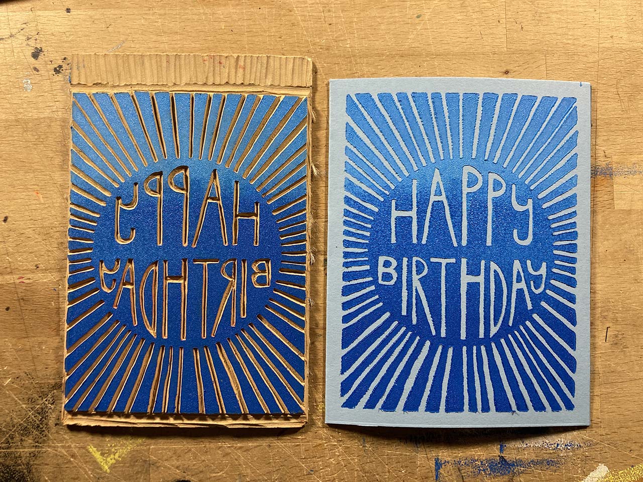
- I've Got an Idea While I don't have a brayer wide enough for the print, I do have more than one brayer. So I thought to use a card behind the glass to lay out the colors and then use two brayers to ink the plate in two steps.
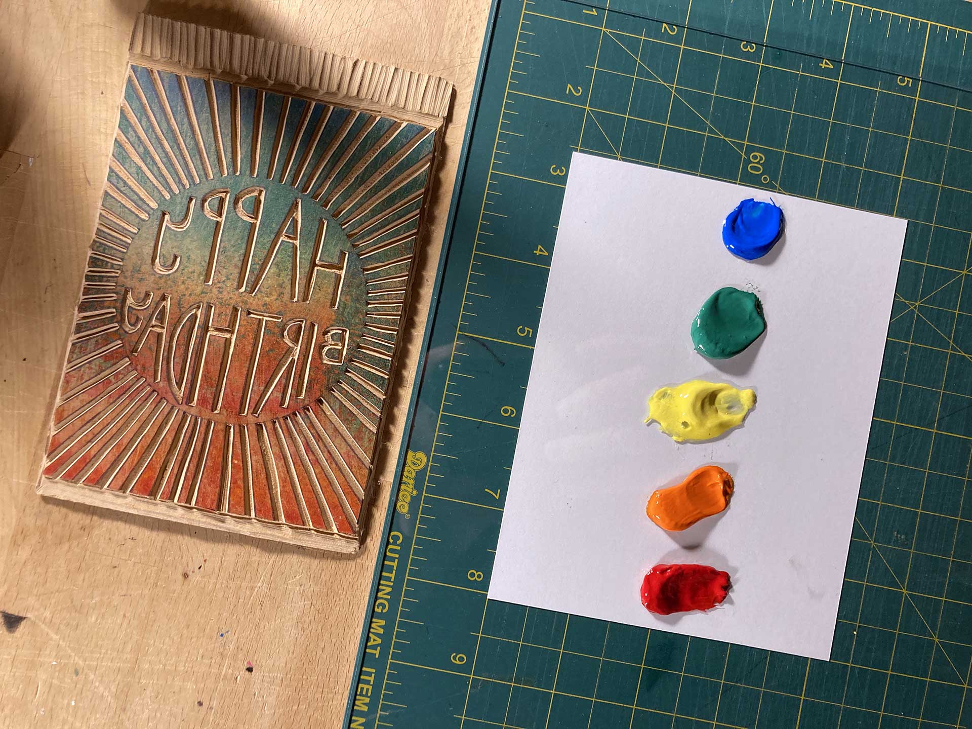
- Voila The result of the two stage/brayer process works! For future prints, I'll separate the ink areas on the glass, realizing they don't have to be next to each other. I've got at least two prints I can send-out for early January birthdays, so that's it for now.
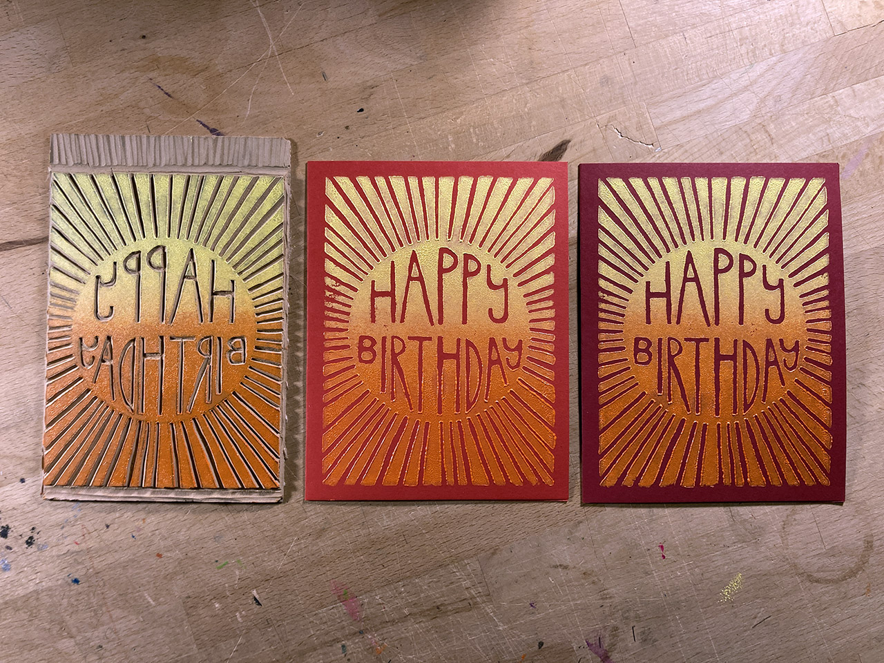
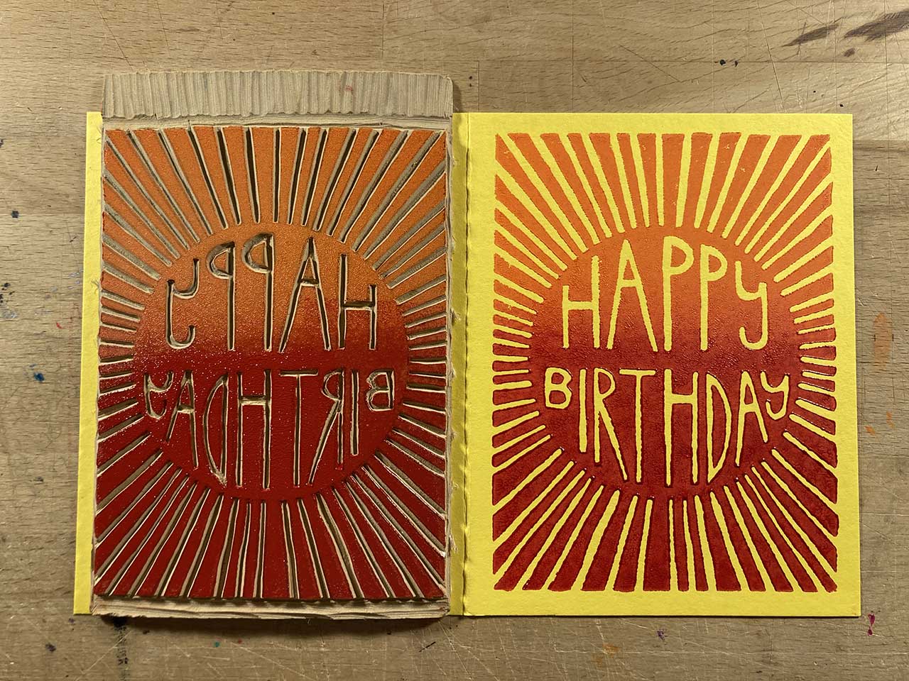
- Red + Dark Red Prints I'm working from a set of 40 cards (4 each of 10 colors). Here are the red and dark red editions.
- So Much For The Special White Ink The first two green test prints used this new "Platinum White" ink I bought, but it was dry and chalky and just didn't work.
- Green Prints These turned-out muddy out of my frustration and just wanting to get them done.
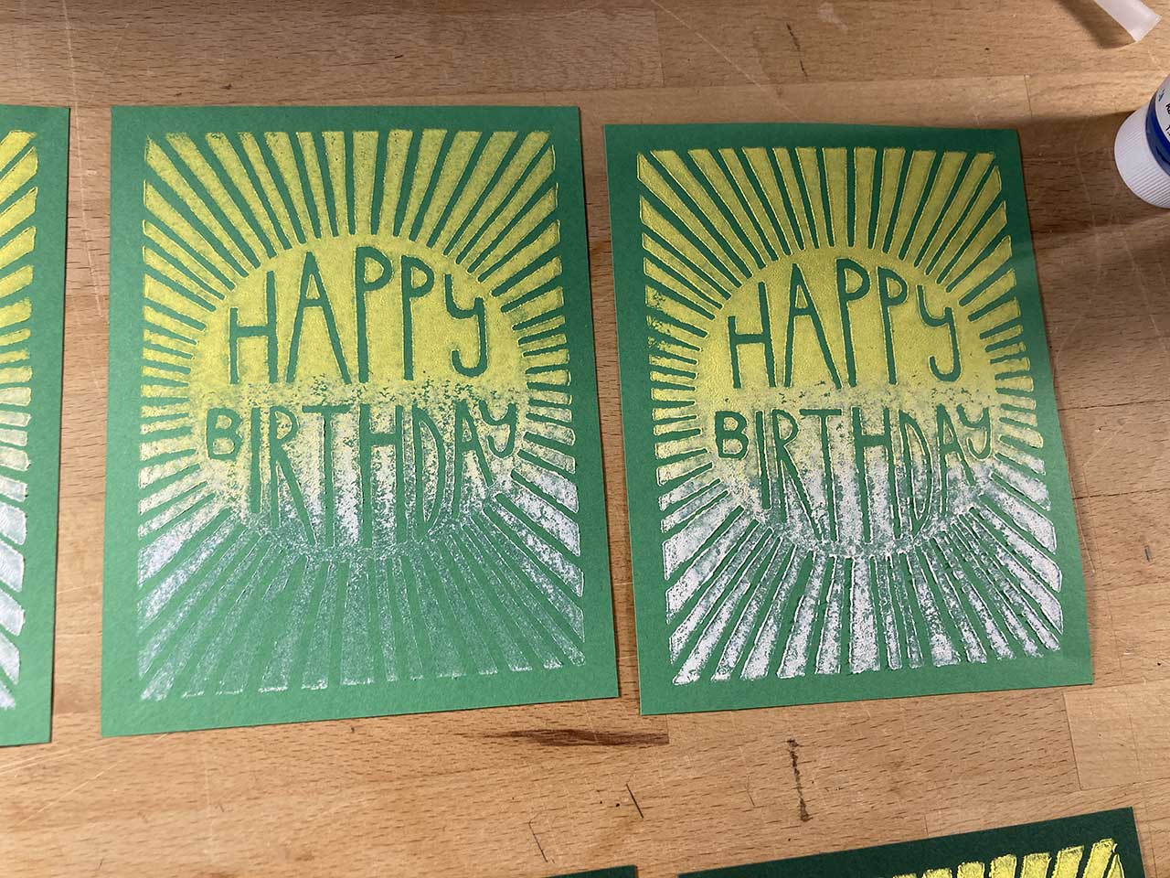
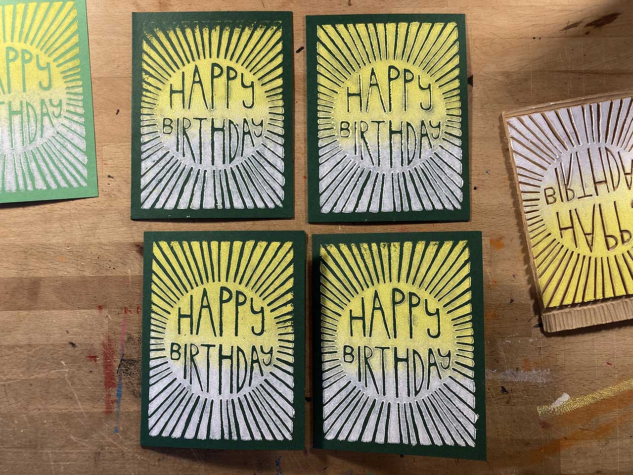
- Yellow Edition Really loved how these turned-out. Reminds me of the New Mexico state flag.
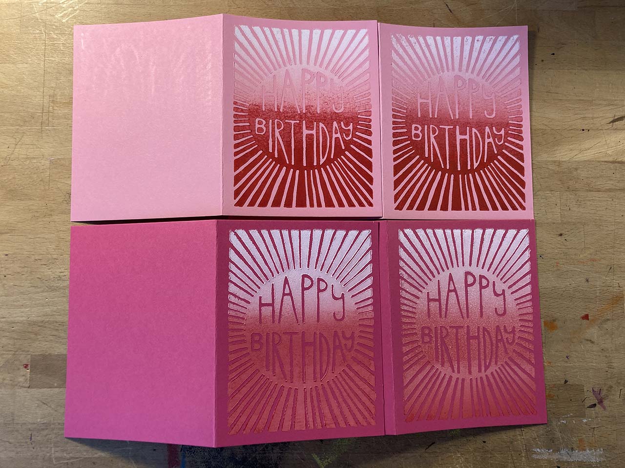
- Pink Editions Learned the hard way here that working with a gradient that will actually create the color of the background is risky. Especially in the light pink editions, the red + white combination created a section that created the color of the card stock and made it difficult to see an image.
- Dark Blue Edition After the issue with the pink editions, I made sure that the blue portion of the gradient wouldn't be too dark blue and went a little too far resulting in a minimal gradient.
- Light Blue Edition Again, the pink edition issues worried me and I wanted to make sure I didn't end-up losing a portion of the image because the gradient matched to closely. The result was a lack of an effective gradient.
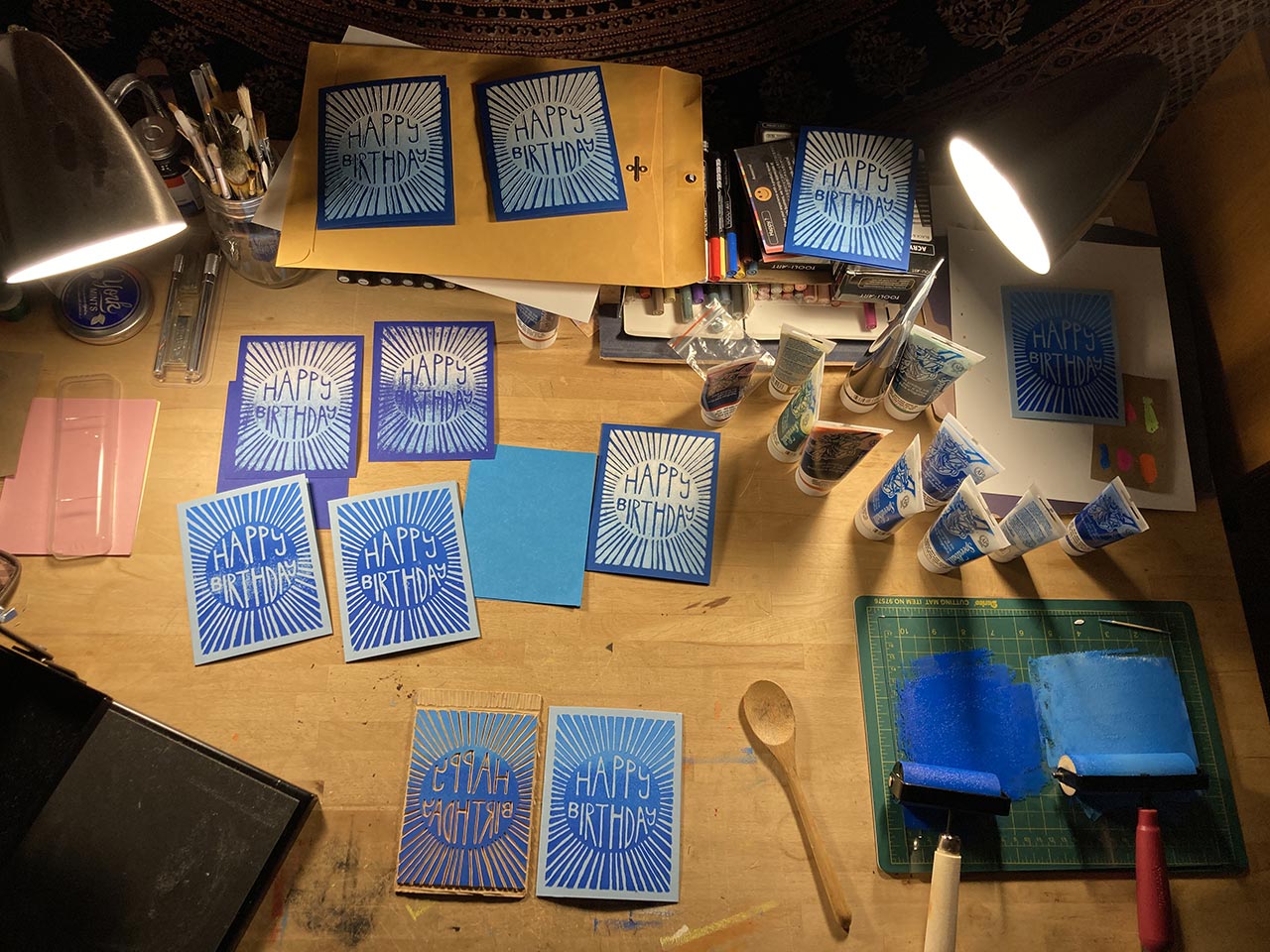
- Workspace at the Conclusion of the Blue Prints The past week has me working on prints every evening. I've only got the purple print left, and then probably a run of tie-dye/rainbow prints. It's been fun.
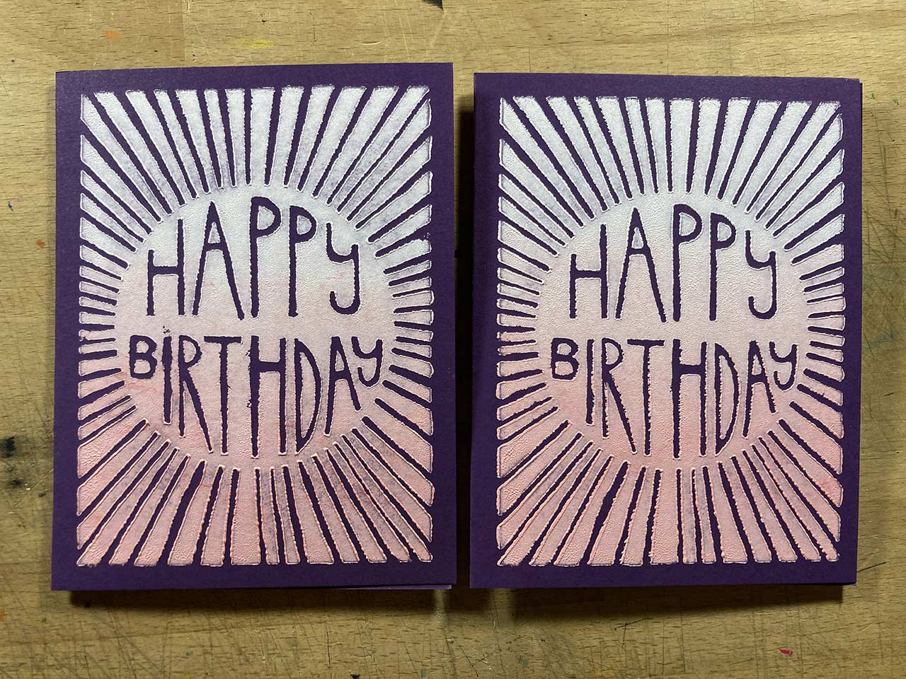
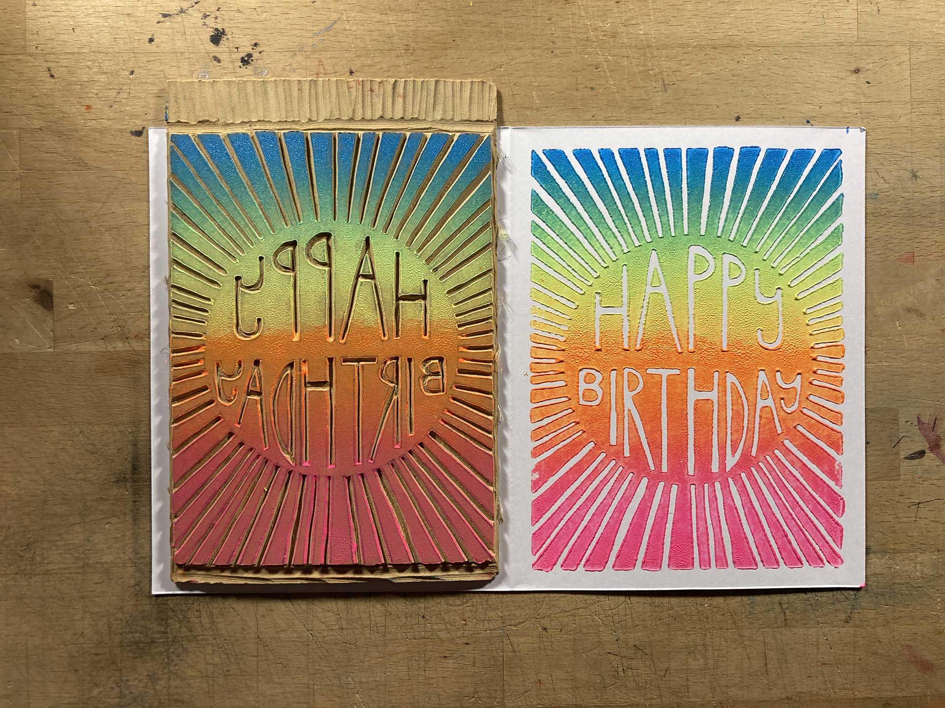
- The Final Color: Purple And the final color is done. Upon completion, I realize that while the 40-card multi-color set was a fun gimmick, only having 4 cards per color wasn't enough. I could've used some more attempts on this purple edition, as well as the pink editions, to get it right or at least have a couple well done prints.
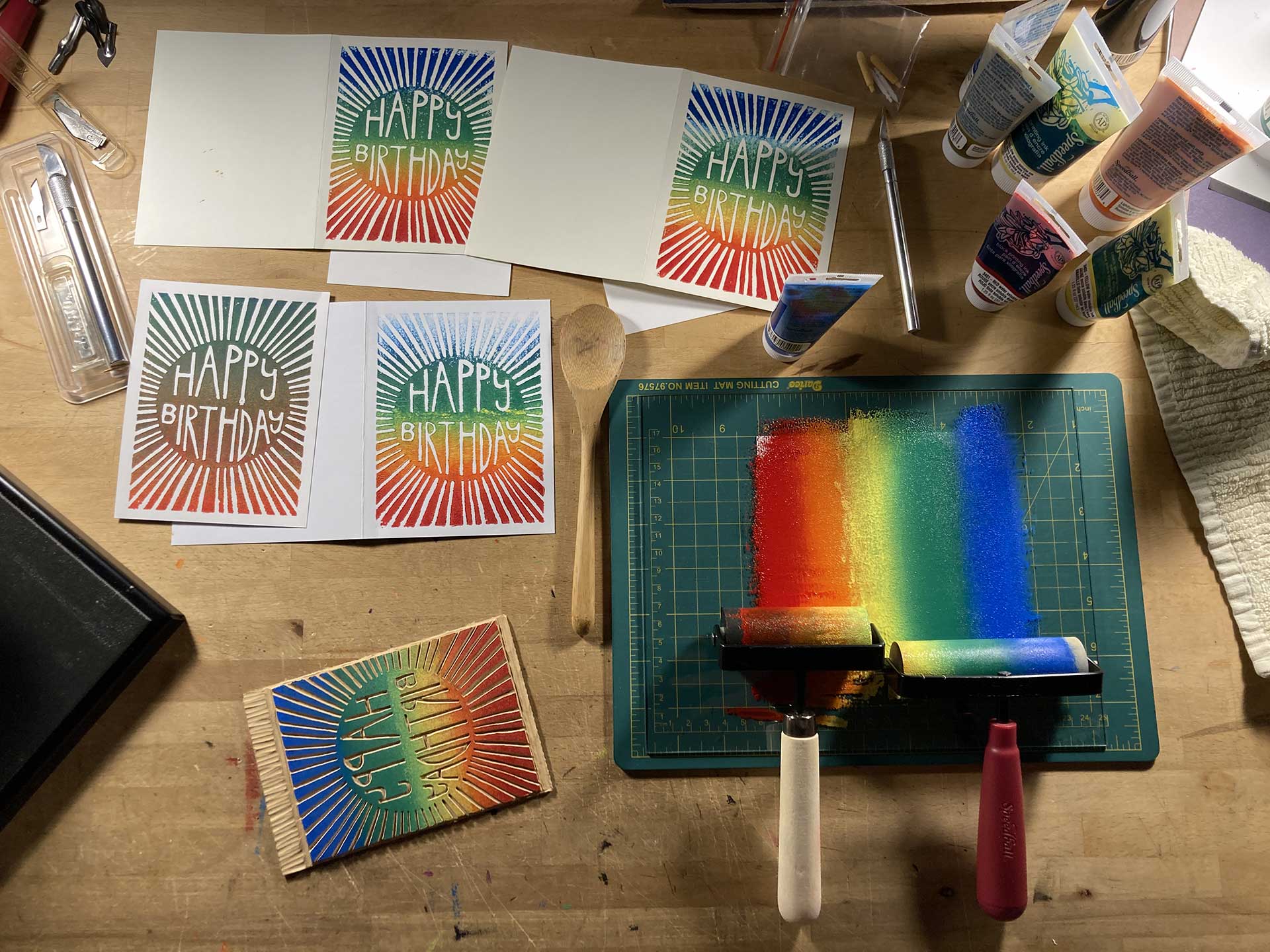
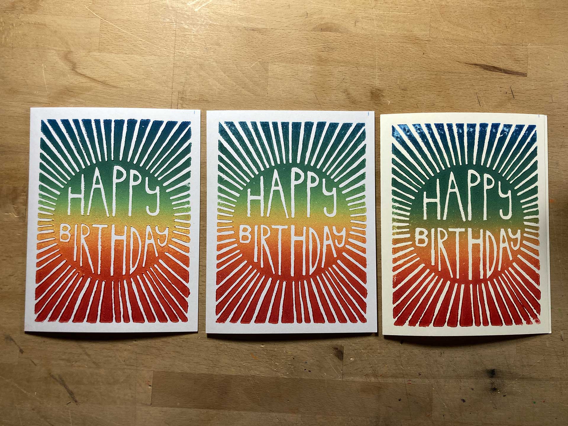
- More Rainbow Prints Decided to knock a bunch of these out so I have extras. Probably should've waited until I got that 6" brayer because using two brayers just isn't working-out well. It tends to lose the middle color.
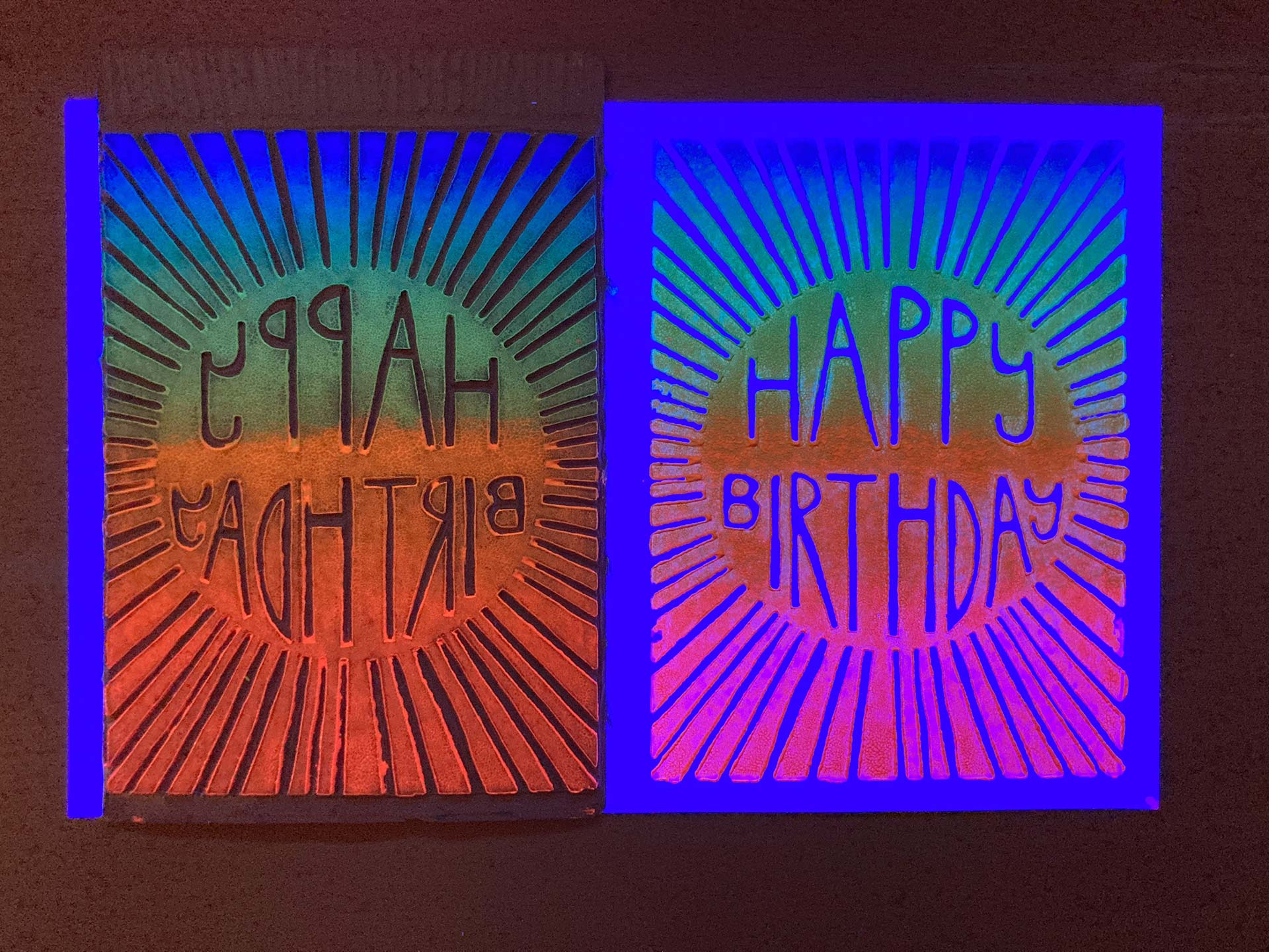
- Extra Credit: Fluorescent Prints I love doing fluorescent pieces that glow under a black light and I put together a complete set of fluorescent inks from Speedball so I could do them.
- Fluorescent Plate + Print Under Black Light Unfortunately, the fluorescent inks just aren't that brilliant or stunning. Pictures of it never seem to do the real thing justice, but it doesn't really matter much with these.
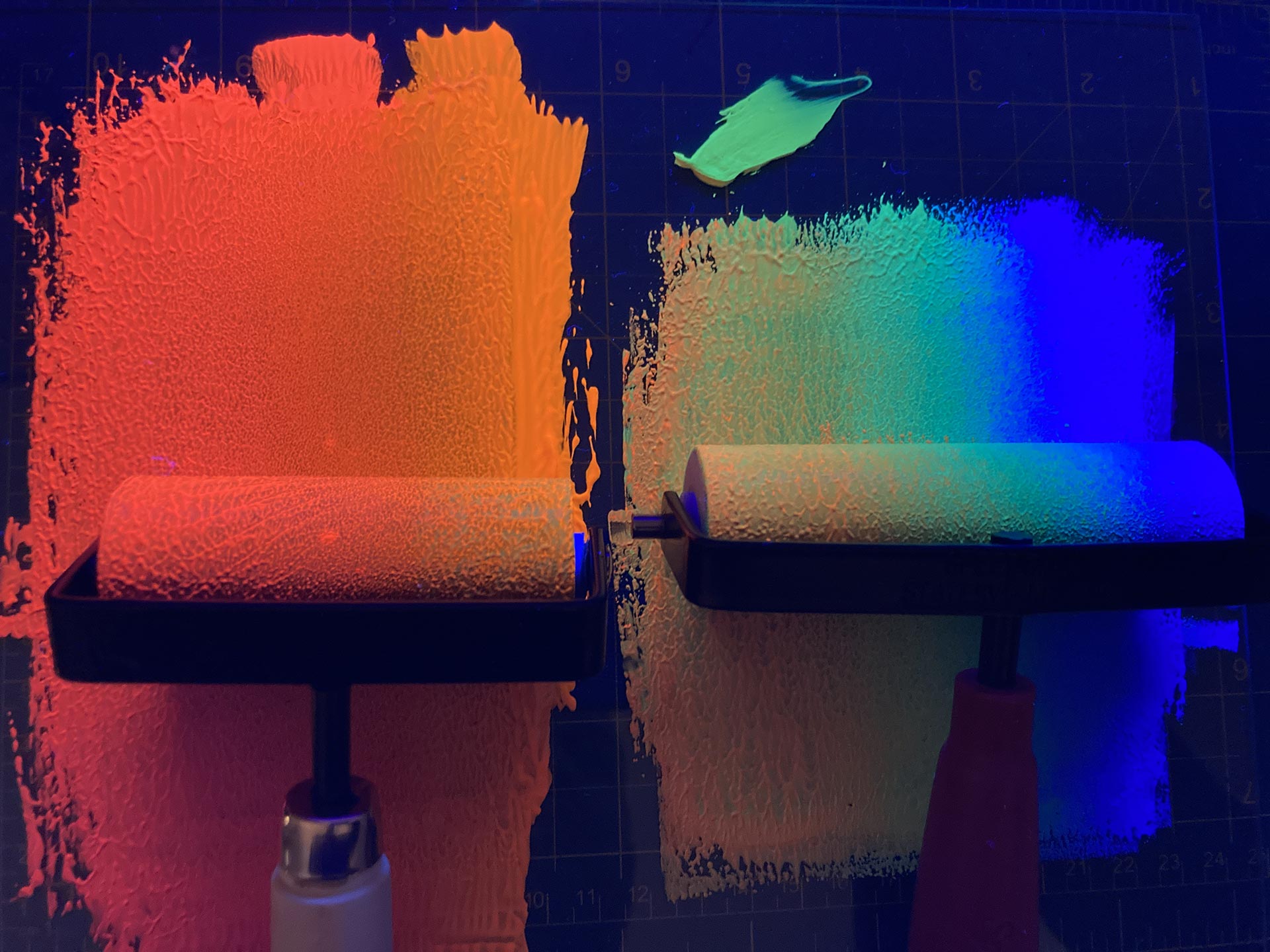
- Fluorescent Ink + Brayers Regardless of the finished project, I still get a kick out of fluorescent media under a black light. Feels like a video game or another world.
© 2026 60bpm